alcie.exe (UAL VER.)
Home // ALCIE YIN

About

UNIT1

UNIT2

UNIT3

UNIT4

Contact

Bin
welcome!
>> click on any of the icons aboveeach unit is separate- press the little X button (top right) to return if needed!(best expirienced on desktop)
about this blog...

thats me!... kinda
UNIT 4 : Animation Pipeline (into the deep end)
Lets start suffering.
This unit, we are to use 9 weeks time to create a full 3d animation from essentially scratch. Fun- in theory- but challenging realistically.Script writing, concept art, storyboarding, planning, modelling, rigging, animating. yikes.I'm glad to grouped with members each with their own strengths, and so we started our first meetings without any hiccups whatsoeverGroup Members: Saki, Ash, Abi, Ash, myself
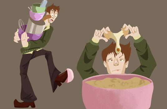
After I came up with the idea of a super unlucky boyfriend who just cant catch a break running into every misfortune possible while baking- we started brainstorming on specific scenes and styles.

Synopsis + Logline


Initial Ideas

(click on the images to expand it)
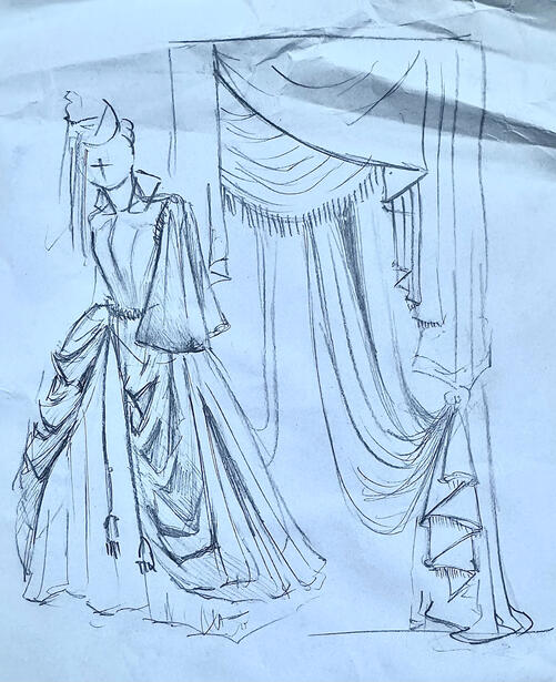
Style
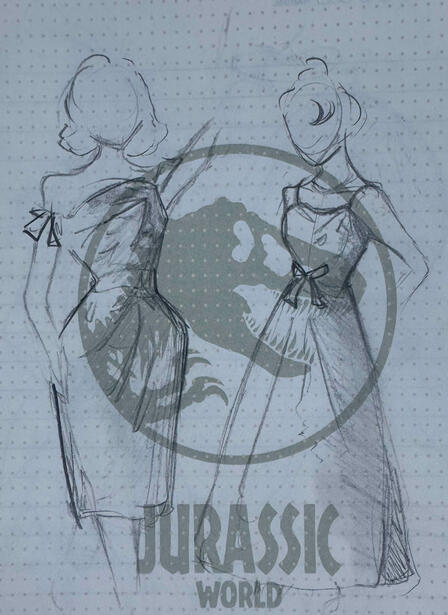
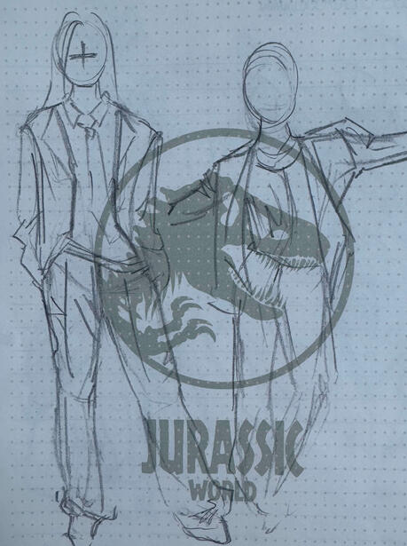
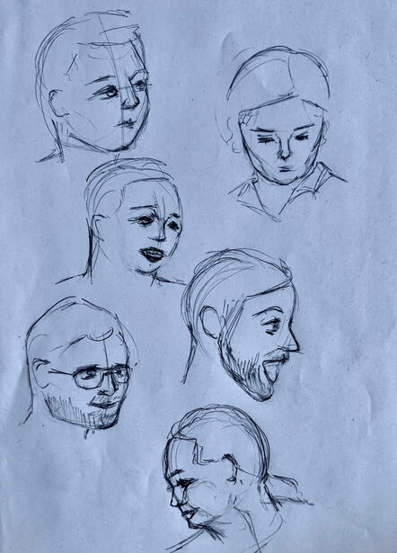
The team actually started discussing art styles first as we're all quite visual people (duh artists). we really liked the sort of low poly smooth and flat almost fake 2d look we saw in a lot of our references, so we decided on that.We've made probably almost 20 pages of mood boards and reference images- we were pretty dedicated. Ash really wanted to focus on the character design aspects and did that, the last two images in the gallery below were her research.


Script
Honestly- we just wanted to jump straight into the art, so having to write out an actual script was somewhat painful for us. We all sat down together for a long lunch and just talked about what we wanted him to do."He needed to be clumsy and misfortunate, so lets give him rotten eggs and spoiled milk- but also make him spill said spoiled milk- oh yeah lets give him a shot where he just carries and drops random stuff"Thats sort of how our script came to be. Molly helped take some notes during our meeting and we all worked together to write out different chunks of the script just so there was a solid progression of events we could follow while creating.Below is our full script


Saki's Note-Taking Storyboard

While writing the script, we found examples of shots we thought might look good and Saki jotted them down to create a quick storyboard for us to visualize with (doing god's work seriously)There were so many but heres a few of our ideas:oh yeah and we decided our guy's name would be Simon

Lighting Ideas

Camera Shot Framing Ideas


Schedule
I admit, we were originally pretty optimistic about our timeline. We were worried about animatng so we gave ourselves a good 3 4 weeks time.I prefered working in 3D, so I put myself down for pretty much 80/90% of the 3D work (modelling texturing animating etc) while some of my teammates like Abi and Molly really wanted to stay as far away from blender as possible.So that worked out pretty perfectly!Here was our initial schedule:

just in case the above excel embed doesnt load for you this is a small snippet of it

There were some slight issues in dividing up work-Everyone suggested Abi and Saki split the storyboarding in half via the timeline (Abi does 30 seconds Saki does 30) but Abi said it would be 'too difficult to manage' and suggested she does the entire thing then pass it off to Saki, which Saki was okay with so we did thatThen Molly said she probably needed longer to learn Maya, which gave her less time to do prop art which meant we had to take on more etc-in the end we just decided to see and manage as we go
(which btw was a horrible idea and that might have been the thing that destroyed us)
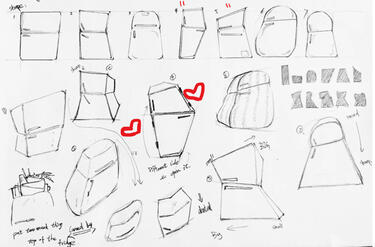
2D Art
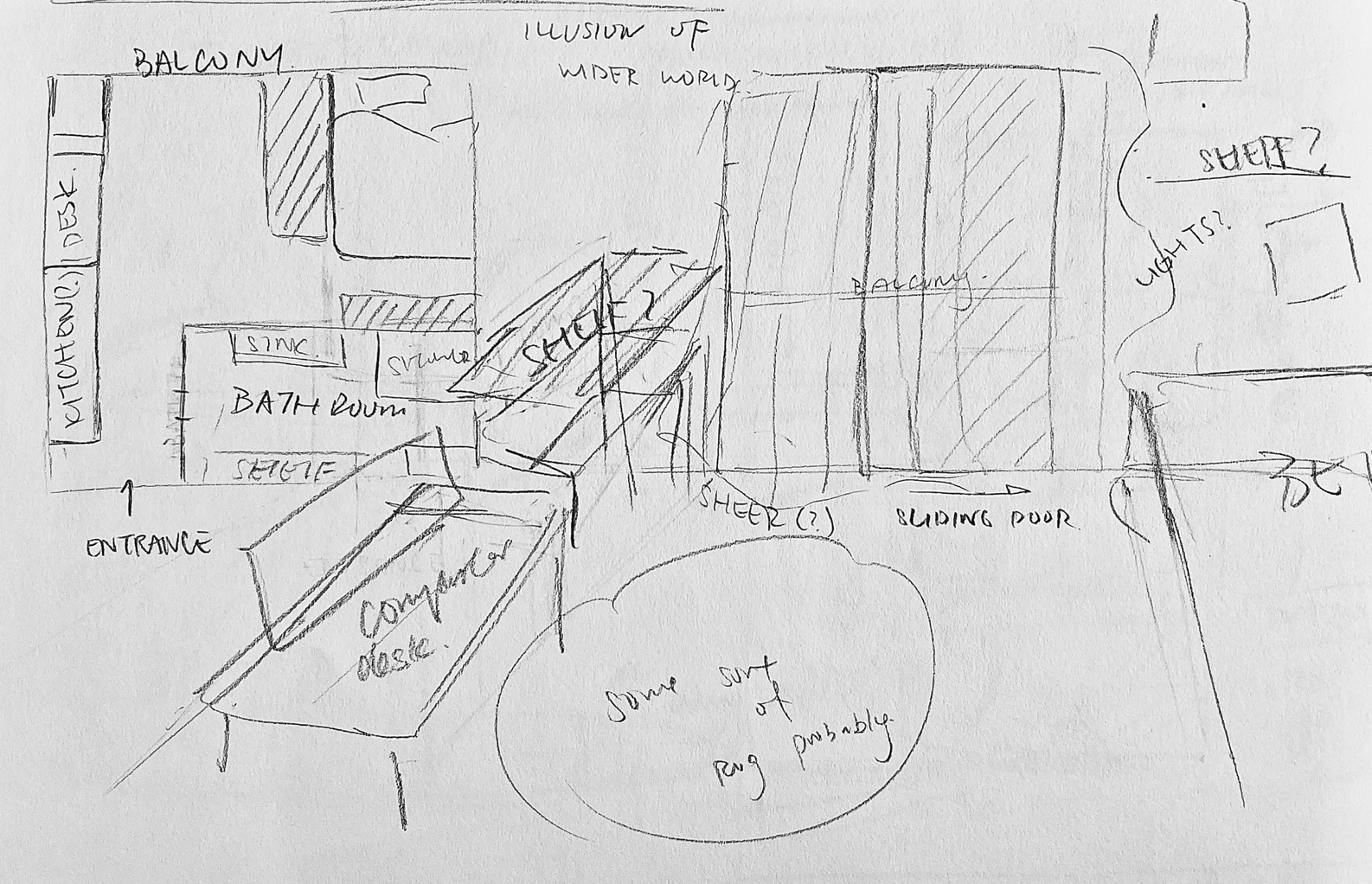
With Abi on storyboarding and Ash working on character design, Molly Saki and I started on the 2d artworks.I volunteered to draw the environmental concert art as I was the one who originally made the floorplan, and the 3 of us split prop art evenly.Here's the concept art for some props I designed with 1960s in mind.
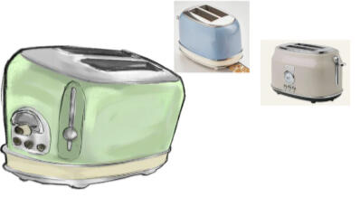
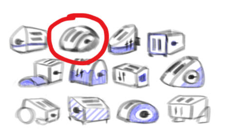
Toaster V1
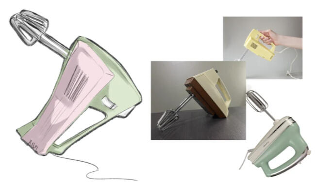
Handmixer

Bowl Stack

Oven Glove Pattern
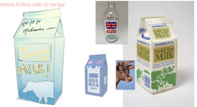
Milk Carton


and what the rest of the team drew:
saki fell horribly ill here, and wasn't present in class for around a week. i relayed all the information to her via text and she completed all her work and sent it to us online

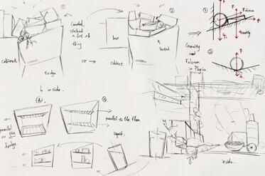
SAKI Fridge

SAKI Fridge Contents

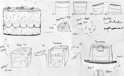
SAKI Cake

SAKI Stove/Oven
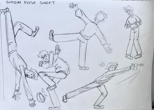
ASH Poses
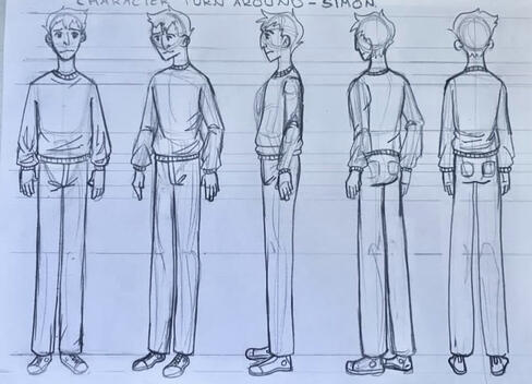
ASH Turnaround
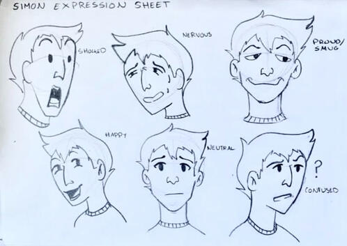
ASH Expressions
ASH 'Simon'
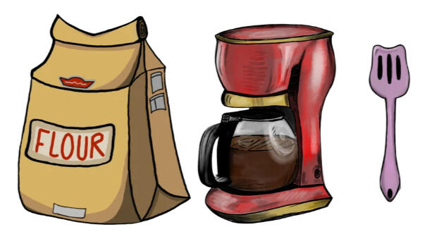
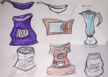
MOLLY Flour + Coffee


Of course I started modelling as soon as I got these concept pieces in

First Blender Models

genuinely think i made more than 10 toasters just trying to figure out what I wanted

a bunch of toasters

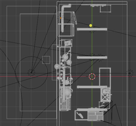
Environmental art was relatively easy for me too, and I quickly pushed out the first version for feedback the first lesson in. I also made a blender mock up of the scene to better visualize the blocking of furniture as 2 point perspective on paper sometimes distorts the perception of space.This was the first version I drew:
Environmental Concept V1

It wasn't bad, but the counters were far too low. Abi requested tables outside of the main working space to match her ideas on the storyboard, Ash suggested more cabinet space and more clutter.While we wanted the kitchen to look somewhat bad- this space also felt a little claustrophobic for a couple (one of which is a very sweet baker girlfriend and we thought she deserved better)That takes us to version 2 of the environment (where I also learnt to start making vanishing points further apart...)

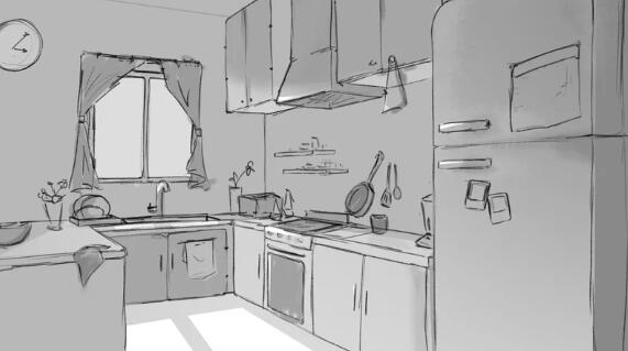
Environmental Concept V2

Now I'm biased- (of course I mean I drew it) but this was my absolute favourite version. The space felt home-y and comfortable, had plenty of spots to dirty up during the process of baking and even the tone I did (which was supposed to reflect evening) looked good.I was originally going to pass this version off to the team for color swatches but then we encountered some... issues
o v e r h a u l
This was around half way through now.Here's where we did a completely overhaul of our art-style in concept art. We realized we have been drawing them in our own respective styles, somewhat ignoring the wacky exaggerated look we had initially decided on.My toaster just looked "toaster" and my room looked like some generic semi realistic kitchen. To really push the style we wanted, we spent the following week redoing most of our concept art.We started from scratch again, this time focusing on cooler silhouettes and wackier shapes:
ALCIE Toaster V2
ALCIE Handmixer V2

ALCIE Coffee Pot V2

ALCIE Enviroment V3


and of course the rest of the team:
remember click to expand
ASH "Simon" V2
ASH Clutter Silhouettes
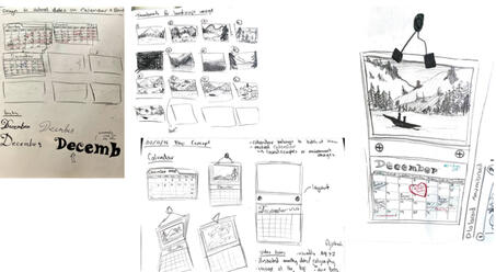
ASH Calendar
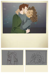
ASH Polaroids
SAKI Fridge V2
SAKI Fridge Contents V2
SAKI Cake V2
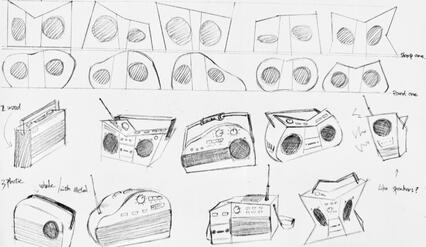
SAKI Radio V1

SAKI Radio V2
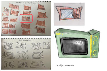
MOLLY Microwave V1
MOLLY Sketches


We also finally saw some frames of Abi's animatic

Abi's storyboard

There were ongoing concerns regarding Abi’s willingness to accept support, despite her appearing stressed by repeated revisions based on Paul’s feedback.
On one occasion, she agreed to send her unfinished work by 5pm so that Saki could assist her, but did not provide it and was unavailable for the rest of the day. She later stated she preferred to handle it independently, which was consistent with previous instances where similar promises were made and broken.I also asked for a clear commitment that the storyboard animatic would be fully completed, timed, and ready by the following Monday with no "yeah I'll polish this later", as the production required it to move forward into animation. Abi felt this approach was unfair and described it as rude, and the work was not completed by the agreed deadline.
After multiple sketches and models, I still really struggled getting the wacky look right.I really haven't modelled like this- where its all cutesy and every edge is beveled and wonky so that was real tough
I asked for some advice on how the cabinets should look and this is what Abi drew for me:

Abi's cabinet reference

She gave me two versions so I asked her if she could draw it out on paper for me the most ideal cabinet layout:

Abi's paper version cabinet reference

Based on these changes and reference, I quickly remodelled a lot of our stuff (refer back to 'a bunch of toasters')

I was also helping Saki learn Blender, and guided her on making her cheese, radio, and butter bell models:

Saki's 3D work

The cheese was indeed later redone by me to save our computers from explodingMolly made these:

Molly's 3D work

It was quite evident Molly was struggling with Blender (the above took her a week to complete) and since we didn't have much more 2d prop concept to do, she took a shot at the environmental concept while I took over her to-do list.

My remake of Molly's items


Molly's enviromental concept

Color Tests


It was around this time the 3d model we were using (named Jerry) had broken for a second time too. Parts of the rig completely broke when Ash was customizing it.At least I finished modelling the kitchen...


we are now pretty far behind
We were supposed to be animating by now according to our schedule but we don't have a completed piece of the environmental concept, no animatic, no finalized character rig, and only a geometric kitchen with no materials.I basically went "screw the textures we're doing flat colors until we make time", colored the entire scene in Blender, handed the fbx to Ash who converted the materials and lighting- and then we formatted the master and distributed that to the rest of the team.It is currently the end of week 7 of 9.


Abi, after passing off the task of timing the animatic to Ash, decided that she would finish the environmental concept art.She did end up drawing a couple perspective drawings of different layouts, but these were just experimentatal layouts that didn't end up matching our vision.

Abi's environmental tests


Abi's concept art / Environment Concept V4

I then asked her to digitise and render the work (at least tone it), and she agreed to complete it by the end of the week, stating that this would be the final version and that she would not be undertaking any further revisions.

Abi's concept art FINAL

MAYA
The storyboard was enough to animate from. Although it still wasn't properly timed just yet, we knew what shots we had to animate (shots were broken down into camera changes). Ash then very thoughtfully split up our scene into a table
Just in case the above embed doesn't work here's a snapshot:A total of 58 camera changes, meaning 58 shots, split somewhat evenly between the 5 of us so we each got around 11ish shots. Ash and I got the more complex shots with either full body movement or longer walking animations, where the rest of the team got simplier shorter shotsThis meant we should all finish around the same time and have just enough time at the end to composite and make final changes and edits-Is what I would say if things went according to plan.

During a team meeting Paul suggested that one team member take responsibility for timing each shot and creating a basic layout for every scene (shot length and starting positions) to streamline the production process. Abi volunteered for this role during the discussion, and the rest of the team planned their work around the expectation that these layouts would be provided.The evening before the deadline, however, she informed the team that she had other commitments and would not be able to complete the work as anticipated, and we ended up doing it ourselves.
Challenges
Some challenges did emerge surrounding communication and asset availability, which created delays in completing certain shots. To maintain our progress, I took on additional modelling responsibilities and created the missing props required for animation before distributing them to the team ie: flour bag, bowl stack, cutlery...
Another issue rose with the design of the fridge model. You might have noticed that the first fridge model after the art style overhaul is different to the one present in the final animation.It was literally because we couldn't fit a camera and items comfortably in a coffin shaped fridge. Which was a shame, but really we should have anticipated that.At this stage, there was also a slight redistribution of animation work to maintain production progress and accommodate varying confidence levels within the team.

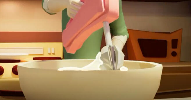
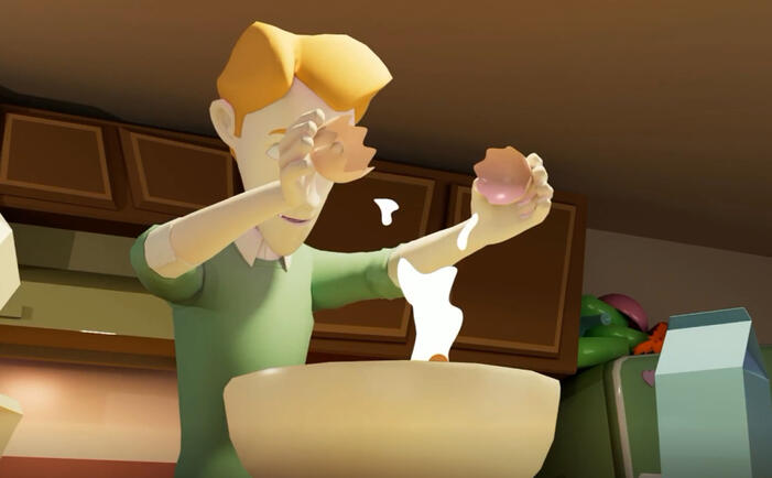
Then was the liquids issue. Again, really something we should have anticipated beforehand, but we completely forgot about the need for batter to fly everywhere and for eggs to be cracked and milk cartons to explode-Luckily we have our "I rather do 2D anyday over 3D" teammates who agreed that the best course of action would be to do 2D animation draw-overs ontop of our finished and rendered 3D shots.Here's an example done by Saki and Ashi:
SAKI
SAKI
ASH


We also had this passage of time thing with the skybox- but we just decided to do that in post too with some compositing tricks.
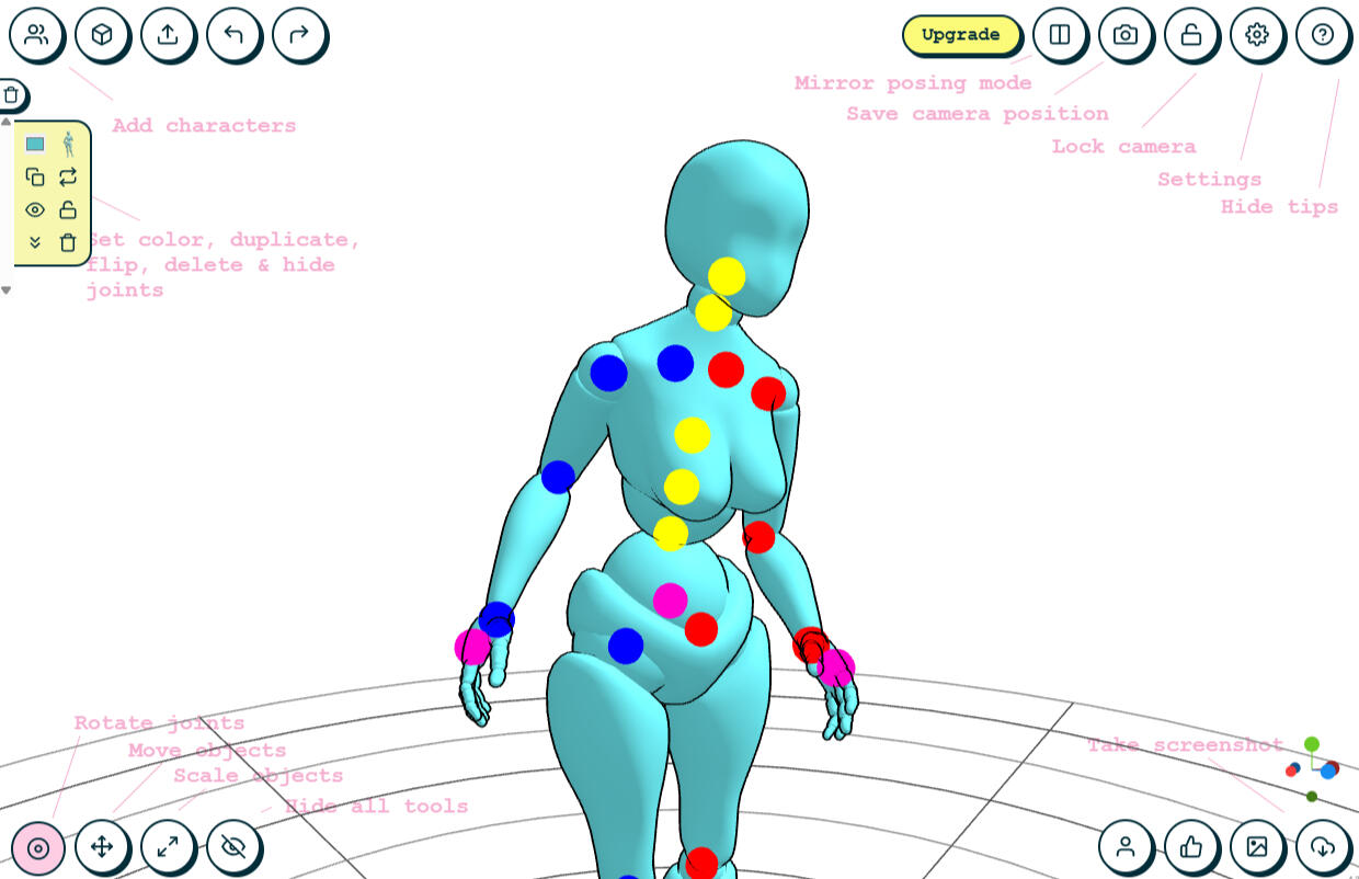
RIGGING
which honestly wasnt too bad
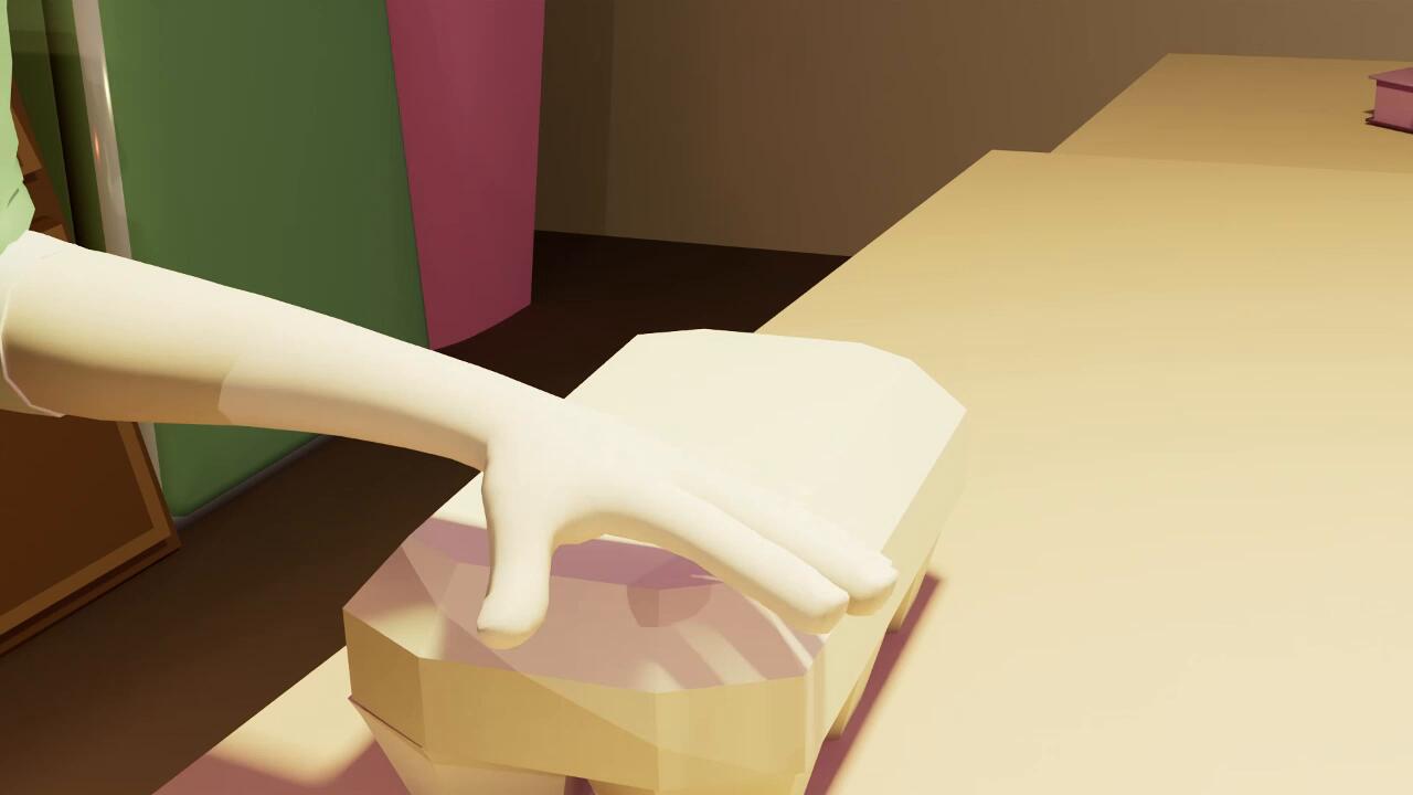
I took on the responsibility of rigging all complex props (with the exceptions of a stack of pink bowls and books). This- although new was easy to grasp as I had some experience in Blender previously.After receiving guidance from our tutor Drake on rigging the egg carton, I adapted my skills to create additional rigs for the cracked egg, cake, and flour bag. This allowed our props to be picked up and manipulated (stretched or thrown) in each scene.They also introduced functional elements into the environment, including a rise-able cake, a flour bag with spillable contents, and an egg carton containing individually crackable eggs.Here's some of the scenes I'm most proud of:
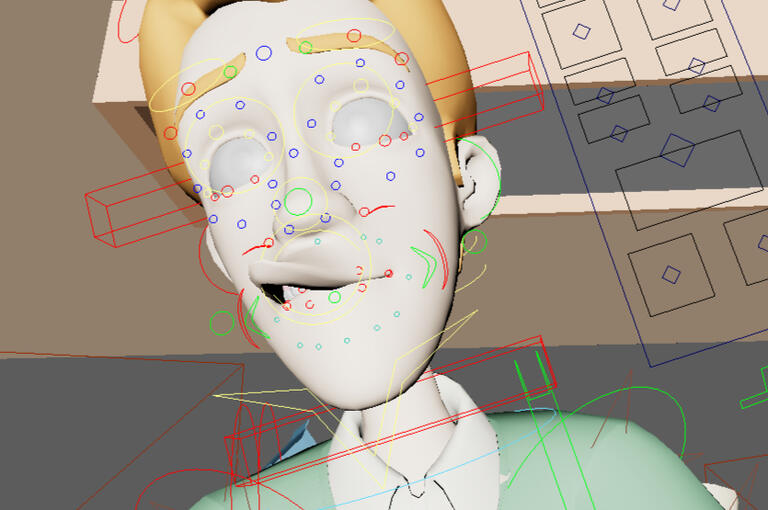
You might have noticed there's a slight issue with his eyes where they don't seem to focus correctly- and that's due to the fact that we were animating with no visible eye texture and could only see where his eyes were once rendered. (oops!)
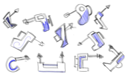
Here's some of the rigs close up!

Egg Carton

Crackable Egg

Cake

Flour


Simon using cracked eggs

Ash and Saki also made their own respective rigs for their scenes, Ash making a rig for a stack of books and Saki for the handmixer.

SAKI

ASH


Final Stretch
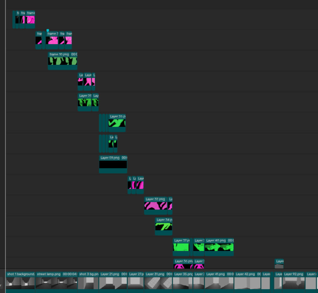
The animation progress sheet was gradually updated, with the exception of Molly. Up until the final week, no visible progress had been recorded. In the days leading up to the submission deadline, she requested assistance. When support was offered after class, she indicated she was leaving and would attempt to complete it independently. While the required work was ultimately submitted by the deadline, the process leading up to it was considered unstructured and didnt align with expected levels of professional communication and planning.Rendering was also gradually being done. I started rendering out my scenes after each completed shot and Ash started rendering everyone else’s scenes, prioritizing the ones that needed 2D animations. We ran into a couple hiccups here with unloaded textures and broken lighting but powered through and found a fix for them really quickly.The last to complete was my shot 50, as I had not noticed the character facial rig was broken in the process of animating and had to redo it.
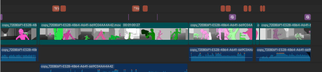
While I quickly reanimated, Saki and Ash worked on 2D animation.Ash then compiled the shots for us in Premiere; and after some quick sound design- we were done. Here's the color grading Ash did to cheat the passage of time


Finale
Ash lovingly helped us compiled together the frames in Premiere, and put background music and some sound effects in as well.When the compiled video was presented to Paul for a final review, several shots were removed due to continuity concerns and overall quality. A significant number of Molly's shots were excluded from the final edit because they did not meet the required standard of completion and polish.
Here are all my shots that made it into the final video! (shot 51 was cut)

Shot 17

Shot 21 + 22

Shot 23

Shot 26

Shot 25

Shot 37
Shot 38

Shot 50

Shot 53


so what did i do in the end?
Idea creation
Plot writing
Script editing
Environmental concept drafts 1-3
Prop concept art for handmixer, milk, all pots, pans, bowls, utensils etc
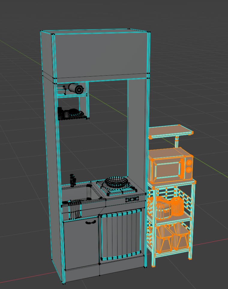
modelling of the base kitchen
modelling of all props excluding 4 items
base materials
base lighting
animating 11 shots
rigging of all complex props
renderingand all the organizing and chasing after people that comes with a group project
And of course, the final completed video.

While the team was able to complete and submit the project, our overall teamwork was hindered by inconsistent communication, missed internal deadlines, and an uneven distribution of responsibility. Several team members struggled to provide work on agreed schedules, and offers of assistance were often declined despite delays in progress.As a result, a significant amount of time was spent on adapting plans to accommodate unfinished work.Although the final project was completed, the process highlighted the importance of setting clear deadlines, and remembering to follow them.Next time, I would have liked to push the model style further. Wackier, more fun- and god give it some textureI would have loved to bring each asset into Substance Painter as that was what I was looking forward to most second to modelling. We had such cool ideas on how rustic we wanted the art style to be, how warm the lighting to be- but we ended up running out of time. At least the 2d animation turned out pretty good, and the overall animation is watchable!Thanks to Ash, Saki, Abi and Molly in helping my idea come to fruition.
Oh and heres the link to the onedrive in case you lost it
UNIT 3 : Storyboarding and Animating
IDEAS!
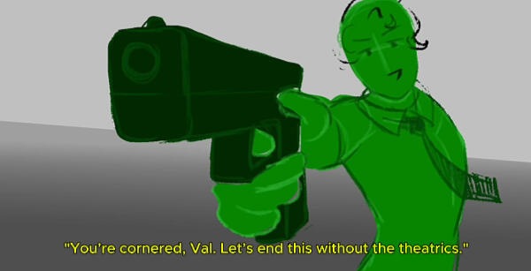
For our third unit (and first graded assessment,) I was required to create a digital timed animatic based on one of three provided scripts.This task immediately presented a challenge, as I am less confident in 2D art- particularly when it comes to drawing exaggerated action poses.I needed to really research and gather a wide range of visual references. Selecting script one, I began by breaking down each line, identifying key moments where important shots would be needed. I also made quick sketches to note down ideas for composition, camera angles etc
I collected lots of references from movies with hand on hand combat, namely Fight Club, John Wick, and The Matrix screenshots

Initial References

(click on the images to expand it)
Concept:
The script felt almost like dark romance, with there being banter + push and pull between the protagonist Val and her pursuers (in both senses)I kept Carmen Sandiego- a cartoon thief that almost exactly matched the description given to us in the script in mind when drawing and honestly think that helped a lot with brain storming
Script Deep Dive
I analyzed the script, highlighting and planning actions in my head. A floorplan was also drawn to aid my planning


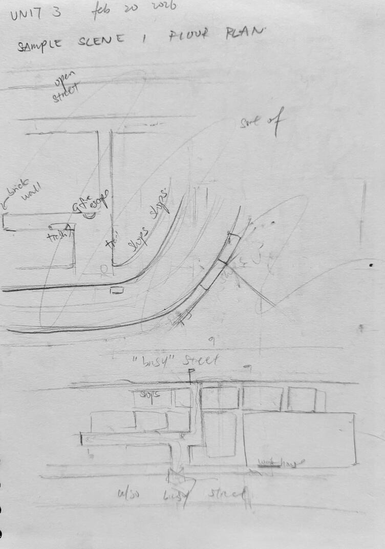
I wouldn’t considering it 100% necceary, but understanding the characters and world youre writing for/ planning the shots for helps a lot in the messages your shots convey.For example, my understanding is that Val, the thief stole something important (A small metallic controller) and is being chased down by a confident and snarky agent (with his gang) It felt almost 007 like, so I also head cannoned it to be set around 70s 80sTeir fighting styles in collaborating with the camera shots contributed to the atmosphere I wanted to create, with a lot of the angles being low (and occasionally wide) angles for a more tense dramatic effect
Initial Sketches
I constantly had issues with drawing things too detailed or too basic- i adapt quickly :3
perspectives were also tricky, but i just opened blender for that
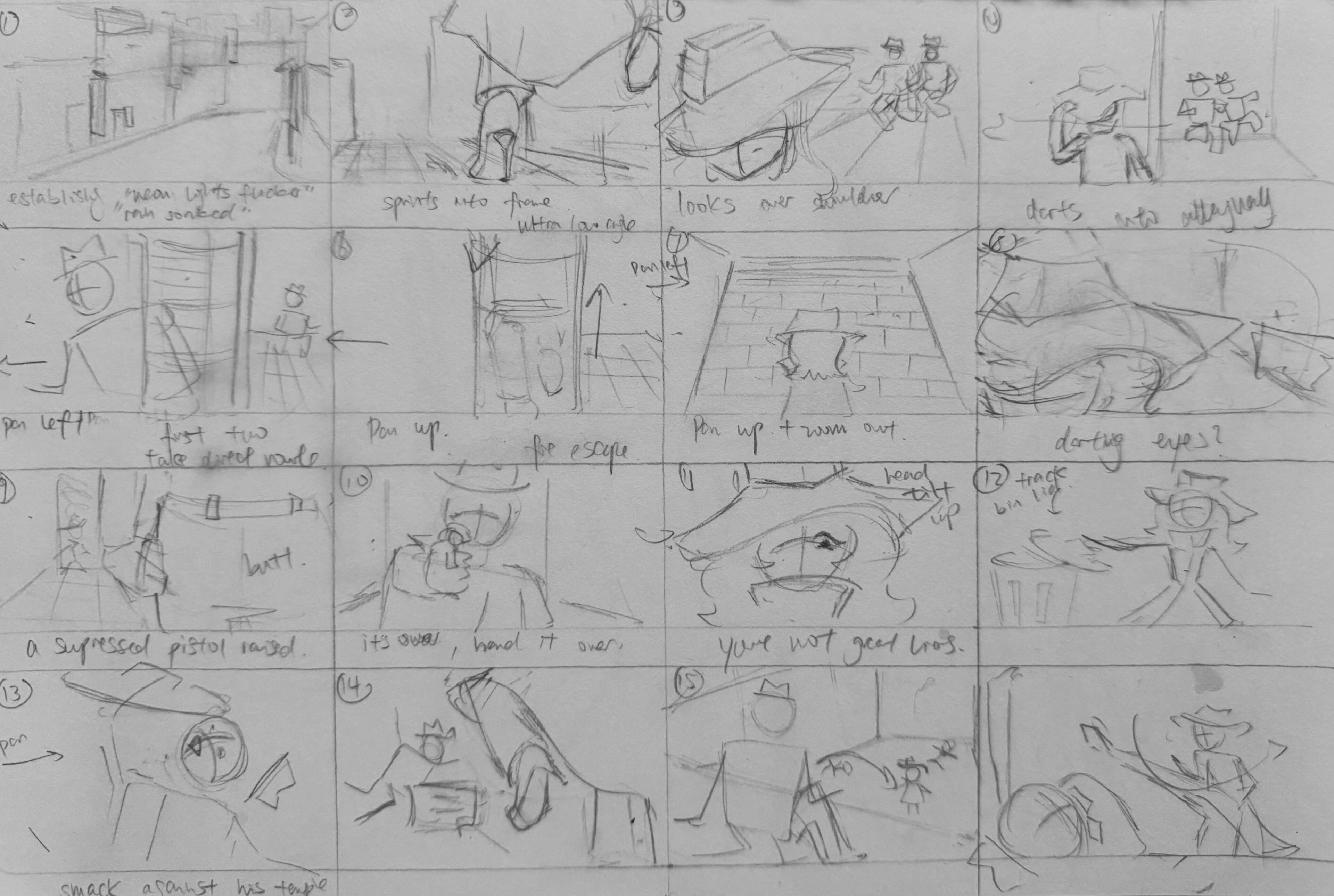
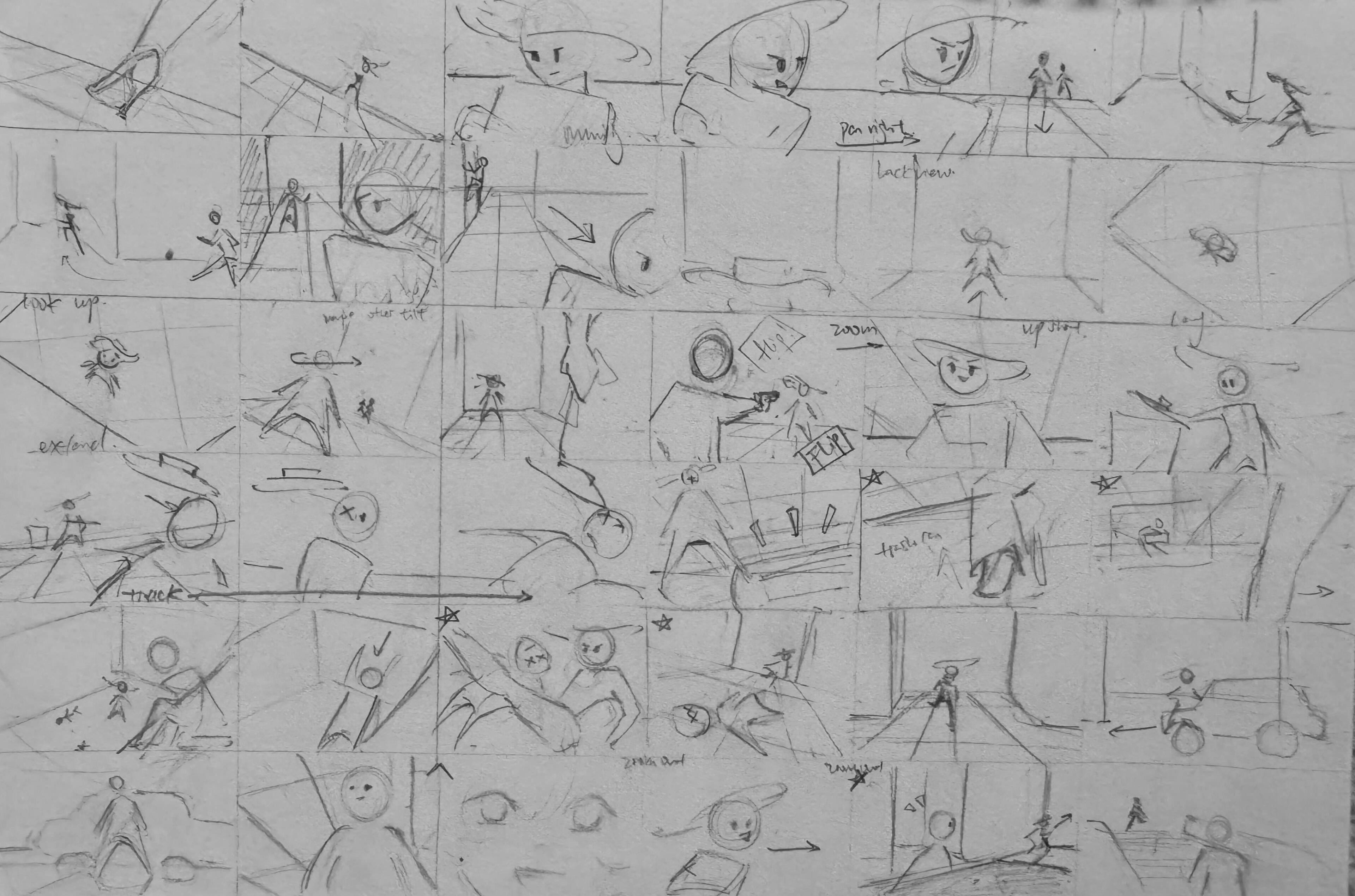
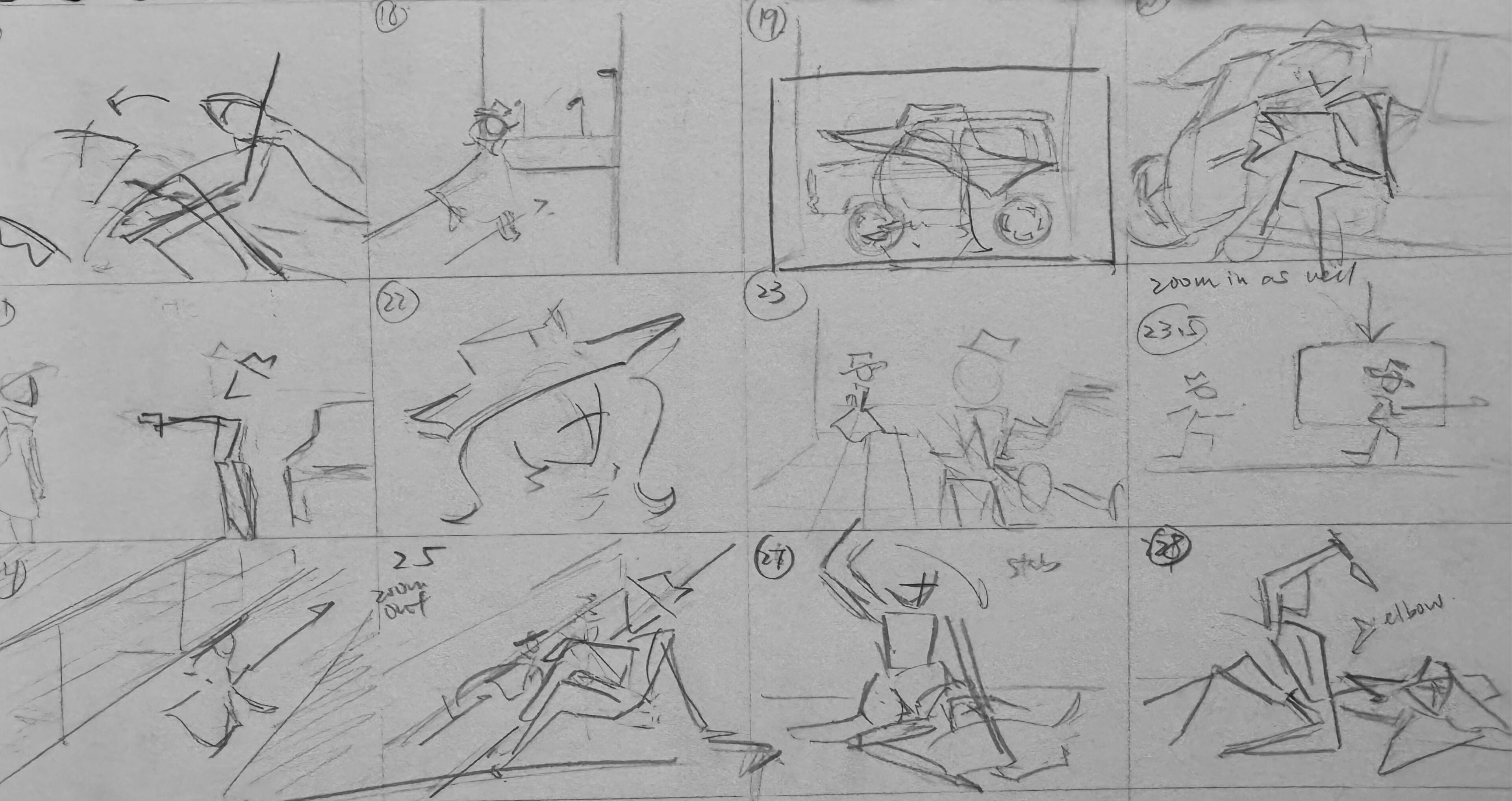
Pencil-board
After completing the planning stage, I moved on to drawing the storyboard on paper. This was mainly to lock in the camera angles, action, and perspective, as smaller details tend to change in the final version.


(oh and i also strongly recommened the webapp justsketch.me it is seriously a god send check this out
I then timed it out on my phone to see if there were any glaring issues mainly checking for clarity and pace
PRACTICE!!!
thank god for life drawing... drawing random people on the underground isnt exactly the same as paul staring down my neck and giving me advice


Time for.... the future?
Yessir this is the part we move to the computer and start drawing our final boards.I was a bit silly and spent way too much time drawing my first couple of backgrounds but I quickly found a good pace to work at.


(hello yes this is proof i did indeed draw this in photoshop i do not own other software thankyuuuuuu)
Photoshop
Since I drew my characters and backgrounds separately and only merge them for the collage, I'm not exactly sure how many frames there are...
Somewhere between 110-150 definitelyAnyways heres 95% of the frames (i lost some inbetweens the morning of the wednesday before submission but its ok bc i already exported the animatic)

pt 1

pt 2

pt 3


isnt it sort of funny how the colors get lighter and lighter :D
Timings
look at this waterfall (its 1/5th of the project)I ended up not doing one shot one layer because there were so many layers I could not open it lol
so its more like 5ish shots one layer :3
this is what that looks like just bare bones
Then of course I had to slap on effects for transitions, captions, keyframe some other stuff...and my favourite part the stupid sound effects and music i added
CHECK THIS OUT!!!
in the end, although i was horrifically unconfident in my 2d drawing, i think it turned out okay. you can tell what poses the characters are doing, and the perspective isn’t too butchered.i’d definitely advise people to avoid doing what i did and using color for the characters- unless you make each one a distinct color. it got slightly confusing, but it was too late to change and make everyone more colorful.it’s also a bit difficult to stay consistent with the coloring, so it might be better to go black and white and use values for depth instead. it’ll probably turn out much neater in the end.oh and idk if the overcompensating with horrific music is workingbut hey- first animatic. not too too bad right?
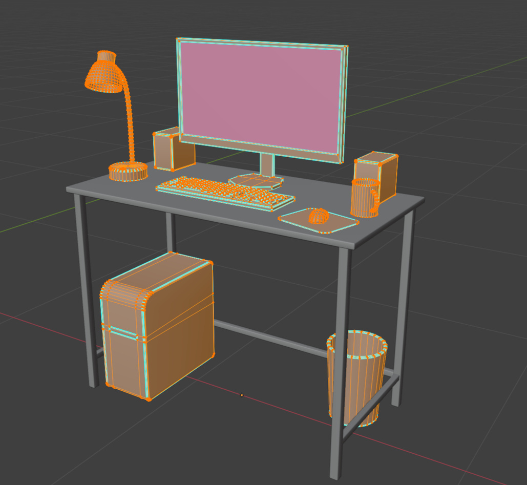
UNIT 2 : 3D Design
EYEBALL SOUP
the least confident I felt doing something I used to be super confident at
Let's start with some 3d spacial practice. Not bad for my first time drwaing in 2 point perspective right?

Perspective 1: Goldfish Bowl

Perspective 2: Break In

Perspective 3: Izakaya

Perspective 4: Sinister Granny

Shadows in Perspective


(click on the images to expand it)
Concept:
I love sci-fi and adventure films, so an Indian Jones inspired project was right up my alley.Due to my experience creating custom hard surface models for space games, I immediatelyjumped to some sort of a space bar that served alien drinks- eyeballs instead of olive martinis for example.I’m super inspired by Chris Doretz’s concept art for Star Citizen, and his work quickly took over a corner of my mood board.As I kept expanding the board, more ideas popped up- everything from space bars to Victorian bakeries until I eventually landed on a noodle shop as a nod to my heritage.
Of course, there were still so many ways to interpret a noodle shop. I could go for a warm, inviting restaurant vibe, or a grimy, unkempt back-alley kitchen walk in.
References and Ideas!
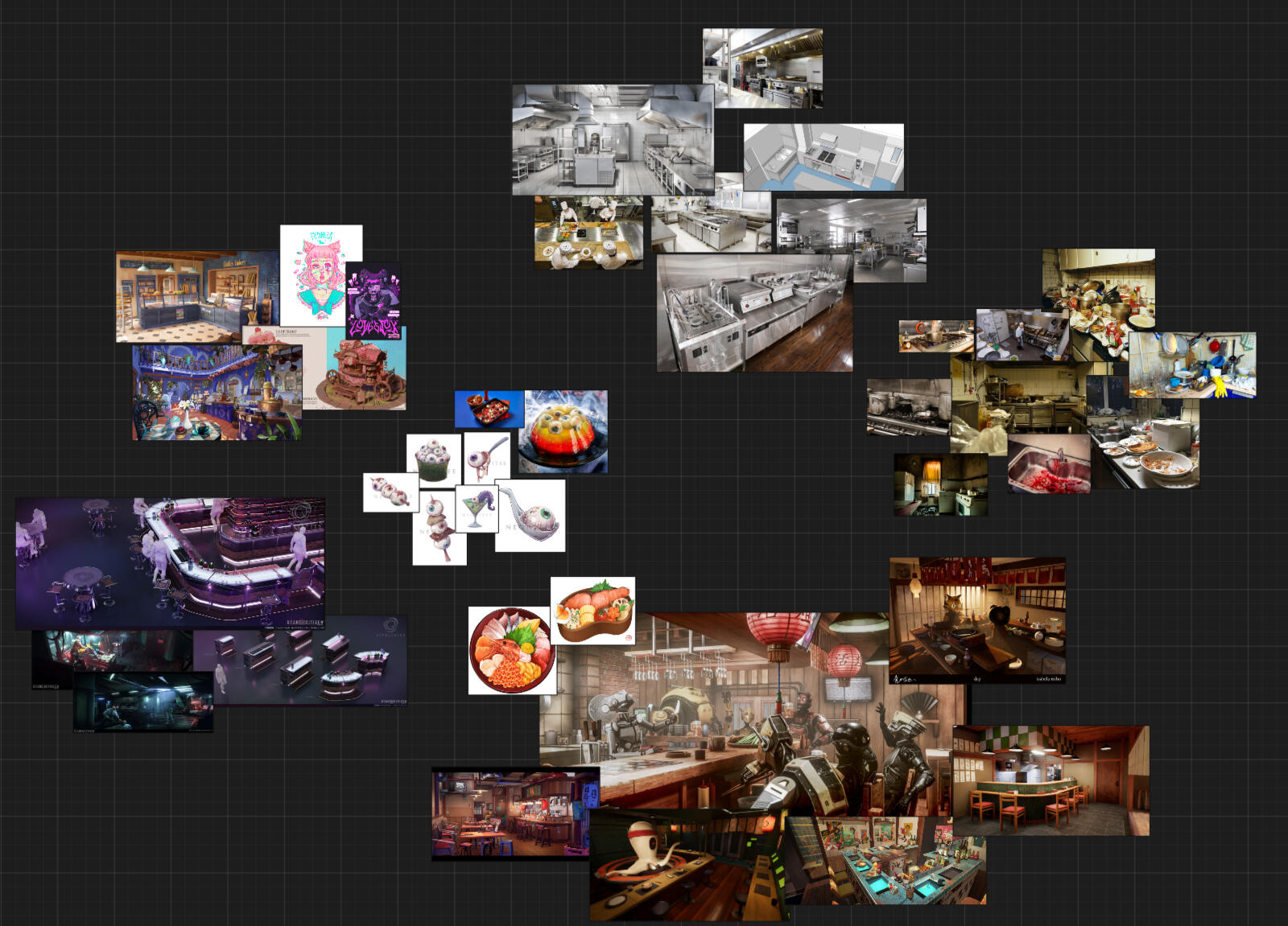
Since I couldn’t settle on a clear scene yet, I decided to explore compositions while sketching my ideas; finding ways to frame a bowl of eyeball soup with me in it, and telling a story thats more than just the objects themselves.

These sketches, plus plenty of Pinterest scrolling, led me to a story and atmosphere board I really wanted to explore
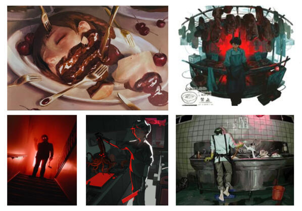
LORE TIME!
The goal of my scene is to tell a story about a craznoodle shop cook with a bad temper.After hours, he lures rude customers he served during service back into the kitchen, brutally murders them (leaves a mess everywhere), and dissects their bodies, taking out eyeballs and blending their flesh into smoothie to use in the tomorrow’s prize-winning noodle broth.The character is impulsive yet meticulous: he follows recipe books down to the exact gram and uses precise surgical tools (like suture scissors and specific bone saws) but still leaves the kitchen a bloody mess after hours.Below is the atmosphere I wanted to convey:
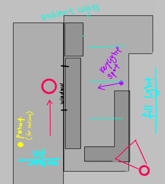
With the help of my lovely tutors (thank you guys for being so patient with my crazy ideas), I decided on a dark kitchen scene.This way, while telling my story and diving into all my gory, disgusting ideas, I could also model tons of clutter and hardware (which I love!)Modeling metal panels is totally my thing, and I couldn’t wait to start on grills and fridges… but first, some planning was in order.
The Conception of Concept Art
I first picked one of my rough sketches and re-blocked out 2 slightly different angles of the same scene.
I ended up picking the one on top because of how much of the kitchen you could see
That, along with the server/waiter window I could be placed behind pretty much confirmed that it was the correct composition
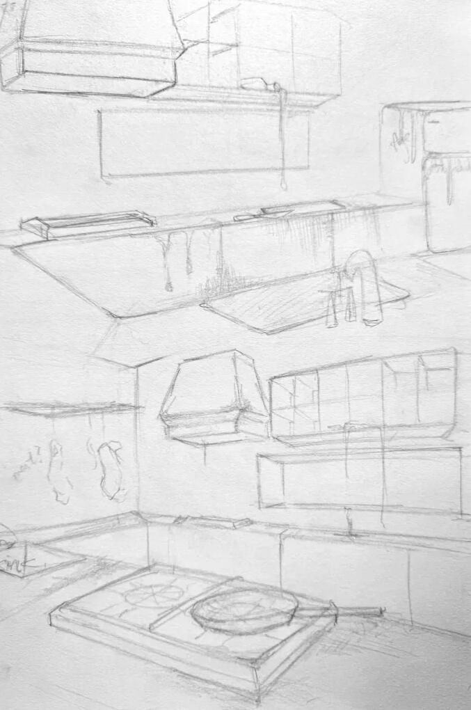
I then refined it on A3 paper, and scanned it onto my tablet so I could clean up the sketch digitally.

A3 Sketch

Digital Clean Up


RESEARCH!
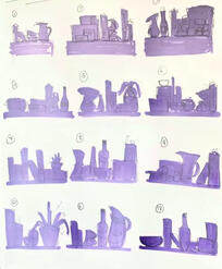
Taking the refined sketch, I started researching common commercial kitchen appliances and made a reference sheet.
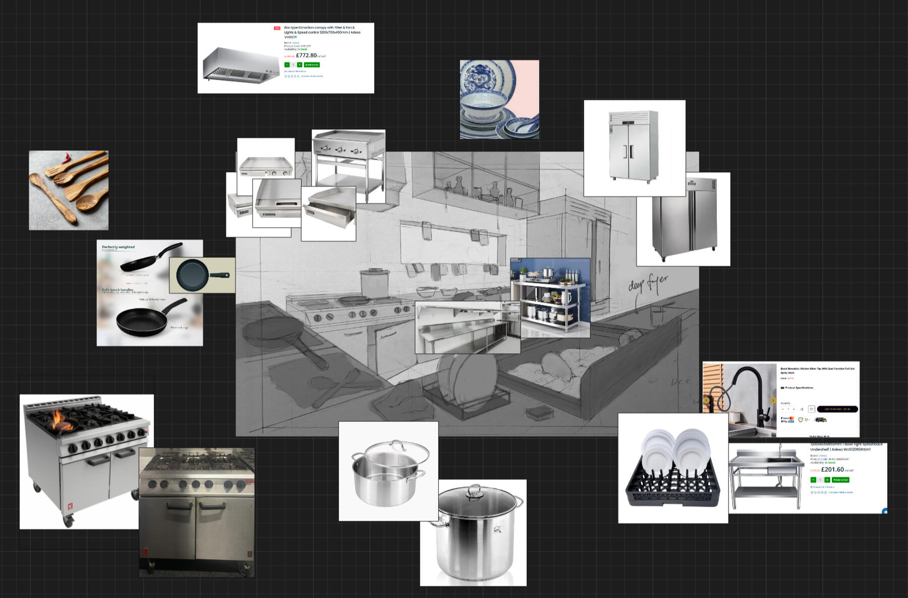
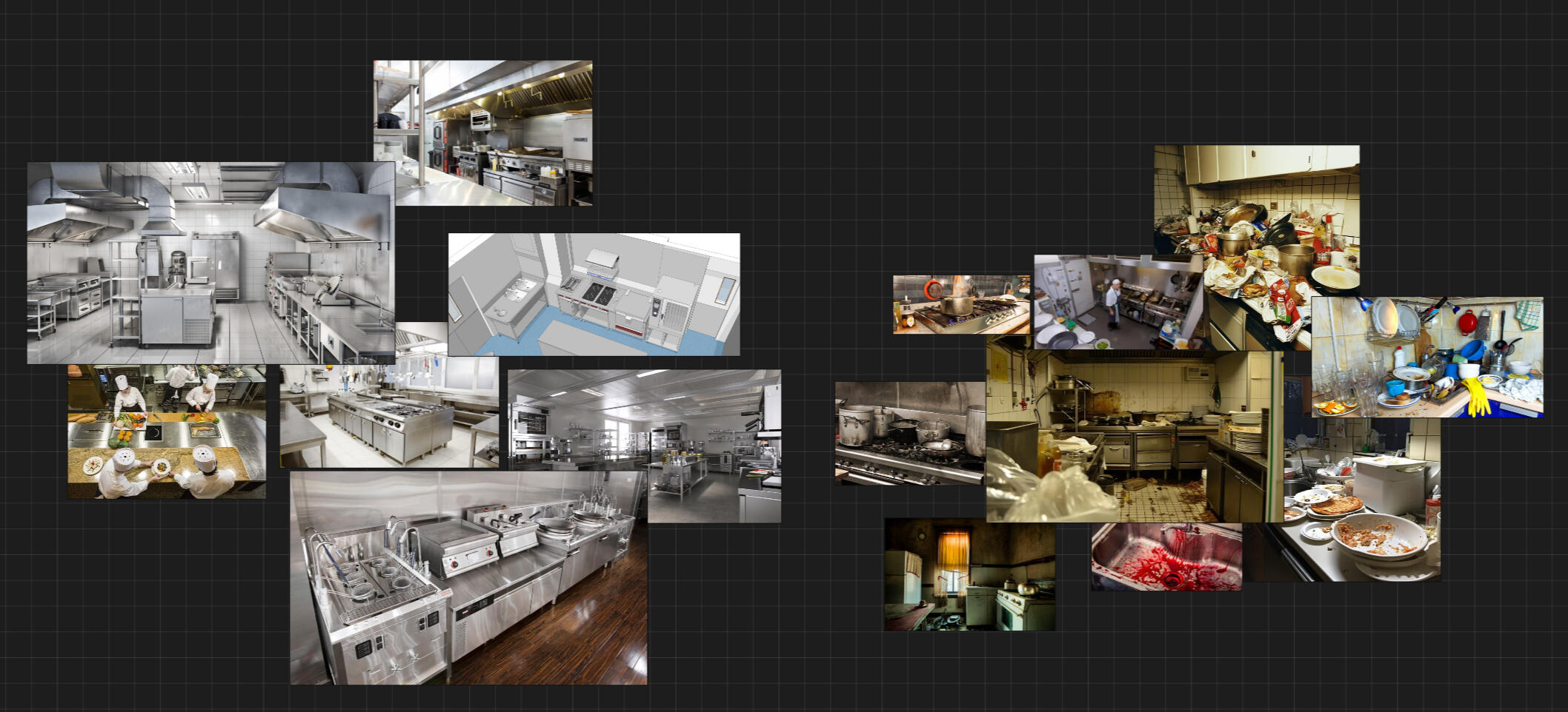
Now that I've looked at the same kitchen griddle for way too long, I could draw a finalized and accurate concept piece to build my 3d scene off of.

Finalized Concept Art

2D OVER! 3D TIME
Modelling pt.1
I knew what I wanted, I had the references, It's time to open Blender.


and honestly so much more- you'll see.
Appending time <3
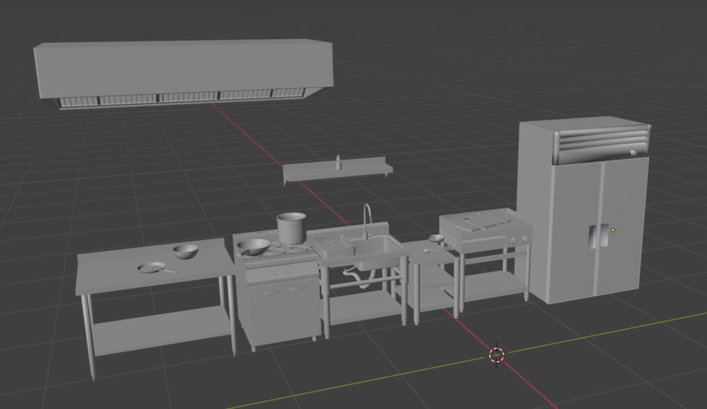
Everything was surprisingly smooth sailing. There were no noticeable scale, geometry or modelling issues at all (other than having to fix my circle array)- sigh*... I'll soon regret saying that
I think I phrased it quite well on my PDF submission so I'll just put that here:
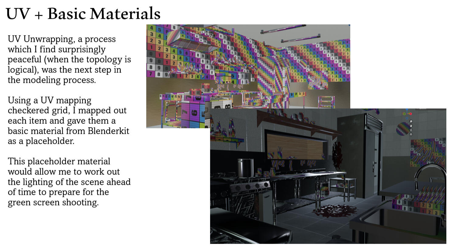
I honestly don't hate UV unwrapping- especially since all the stuff here was hard surface near-cubes. Much easier than shirts and organic stuff.Blenderkit gets one big boom from me
HERE COMES FILMINGGGG
I made the filming deadline with ease as well, bringing in a render and light map for green screen shooting.Ok not really with ease I struggled with the lighting so much I had 5 separate renditions of the same scene....
(the above is a slideshow- wait for it...)
Honestly, they all look pretty similar so im not even sure what I was fretting about.I'll spare you the thousands of images of my rendered scenes (i assume you've read the submission PDF) and show you some footage of me being extremely embarrassed in front of the green screen.light map btw:
the process of filming only took around 10 minutes, with most of it being lights moved around.
hey look at this stupid video i made showing off the key but its too compress and blurry to see properly :c
After exporting the keyed footage into Blender, I also adjusted the RGB curves to better match the harsh, high-contrast lighting of the scene.
SUBSTANCE 3D PAINTER
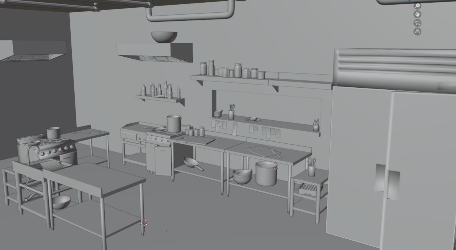
by the second week i was already finished modelling everything needed including tiny lids on bottles and bolts on shelvesthis is where the challenge is
This was the course I followed, and it covered everything I needed to weather and dirty hard surface items(it was the wrong version though so some stuff caused a bit of trouble-
nothing google cant fix)


although things went relatively smoothly, every single time i hit a 'flow state' i would realize something horribly wrong about the UV- this making me redo the entire UV and then exporting and remaking most if not all of the textures all over again.but using substance might have been the best decision i made this project.
very easily (30 minutes tops) i could get my walls to look-
FROM THIS


TO THIS!!!


ok i admit its a somewhat bad comparison shot but the artistic control i was able to have on each spec of dirt and grime was something this project needed.
it instantly made the scene feel less like a barbie dream house and instead much more... disgusting.
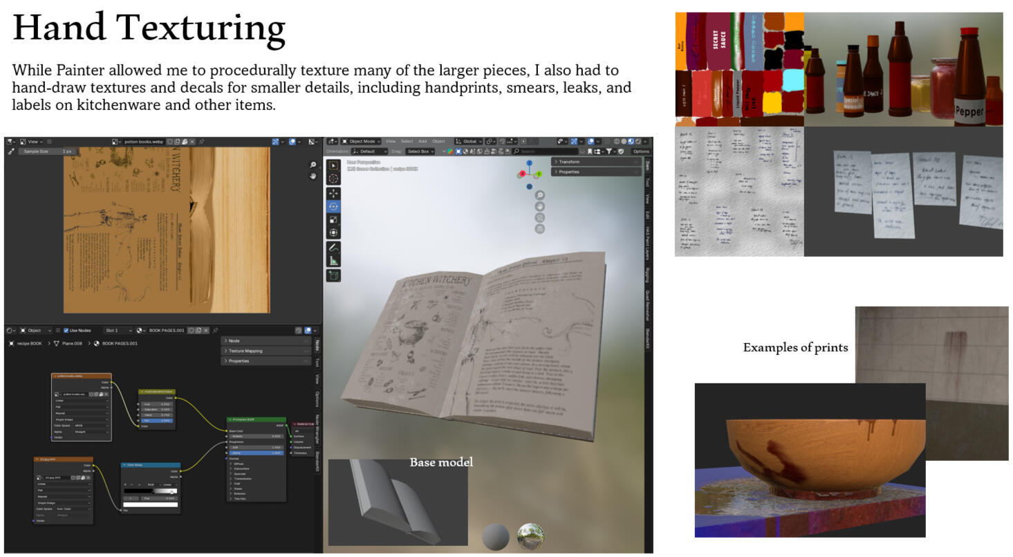
Speaking of UV, now is a great time to show off my mediocre hand unpacking skills


did some hand drawn mats as shown in the PDF
Cheating
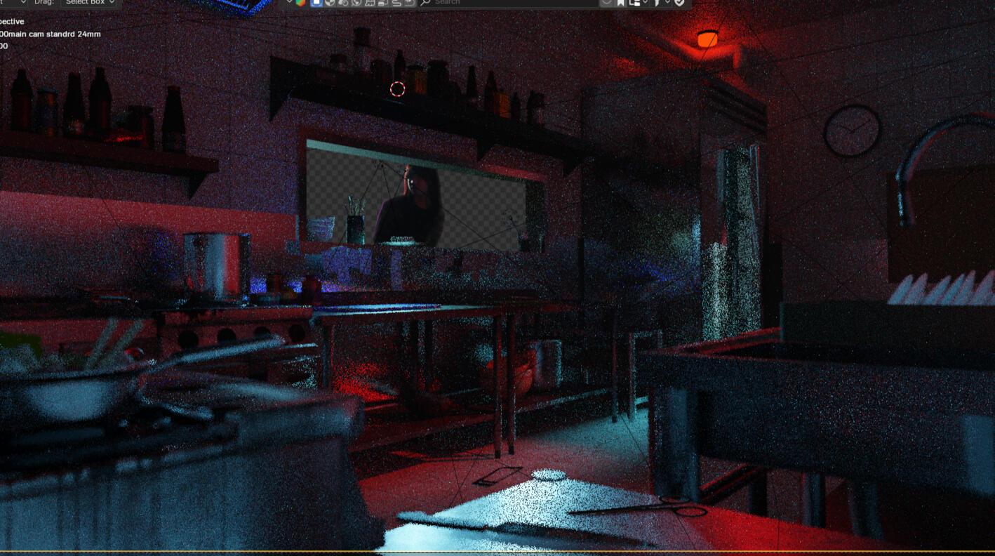
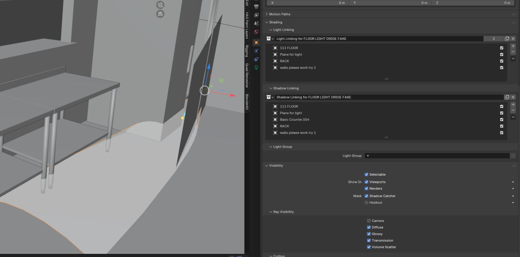
oops you caught memy final scene has 11 lights, 13 if we go by the original plan (they were taken out for rendering sake)
while blender's light simulation is quite accurate and honestly totally enough for the purposes of this project, i wanted more artistic control over the highlights and shadows each item might produce. i already had a diffcult scene to light as everything was stainless steel and extremely reflective- making my selective harsh highlights diffcult to achieve without 'cheating'.cheating- which is me using light linking and taking advantage of rendering settings to create unrealistic lighting patterns that add to the atmosphere and visual appeal of my scene.
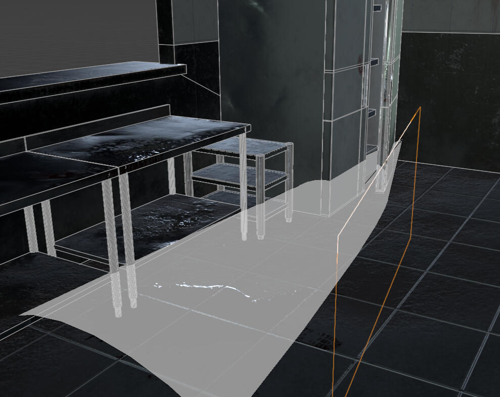
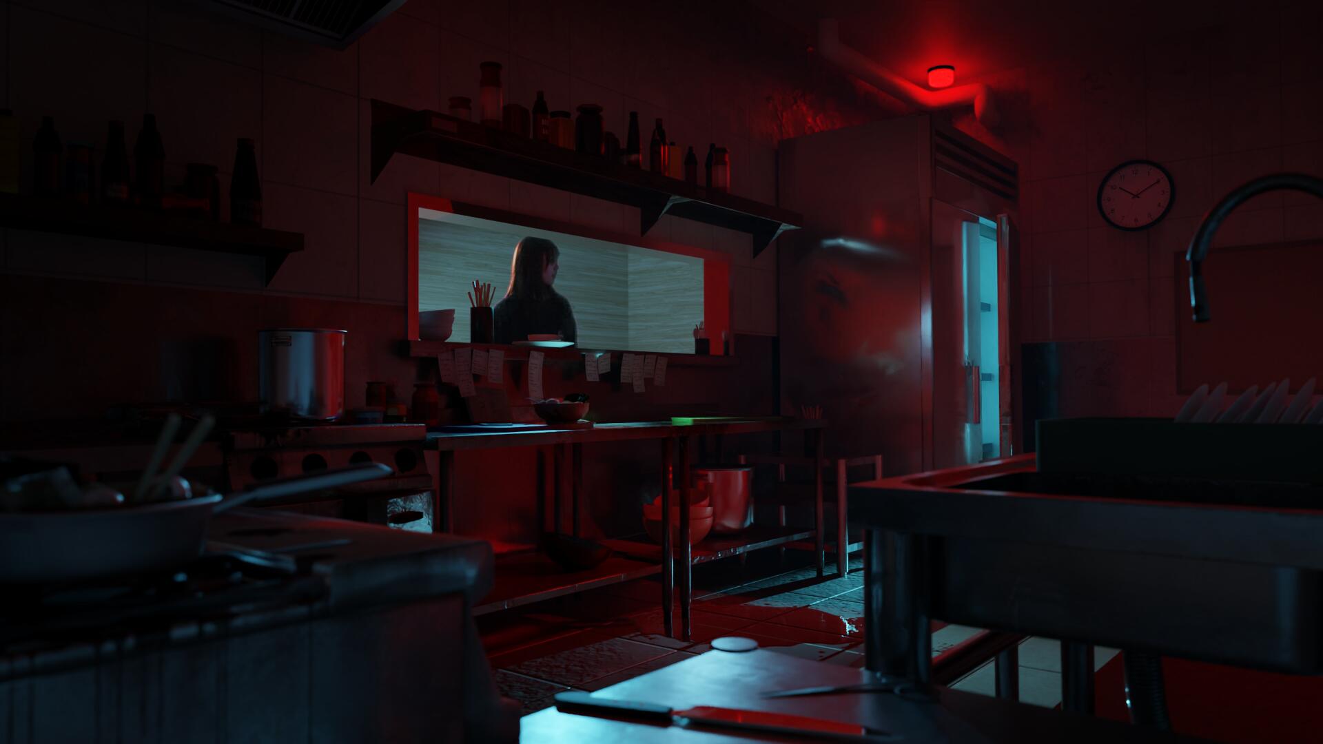
the best example of that is this, a floor glow 'produced' by an internal fridge lightit would be impossible to achieve the shape i wanted with the position of the fridge body and door, so with light linking, i faked the lighting effects to cast a stark spotlight on the floor where a pool of blood was.then, using a plane invisible to the camera, i adjusted the shape of the spot to direct the light in the areas i wanted it to be inthis similar set up is present 3 more times in my scene, highlighting shelves and the edges of counters to create the final look.
Compositing
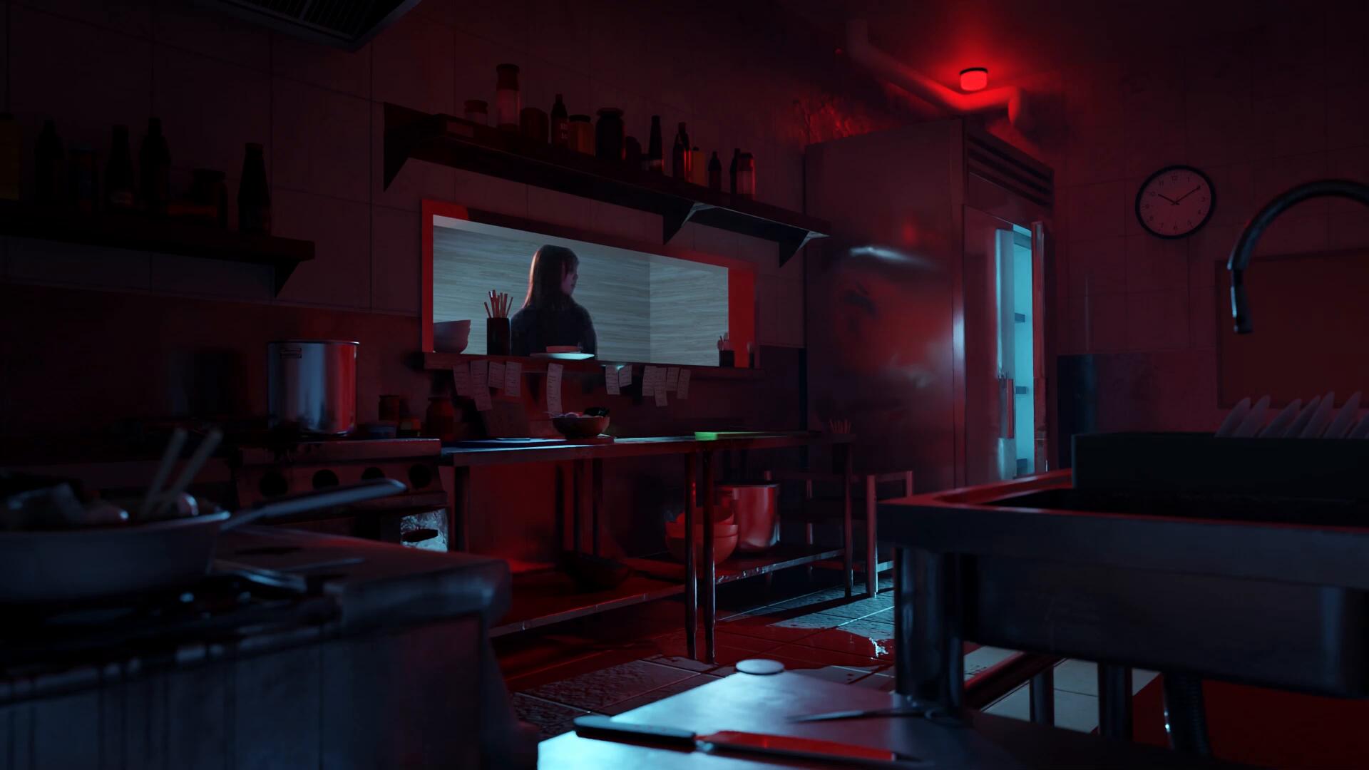
you might think its subtle and not worth the hassle + extra rendering time, but the addition of vignette and fog (using a Z pass) allowed me to direct the focal point precisely to the counters. It also helped balance the scene’s colors, enhancing overall cohesion!


FINISHED!
hey hey come check out the final piece!

Final Render

Final Render w Me

Washing

Cooking

Observing

Consuming


Video (with effects)
Video (no effects)
Afterthoughts:Honestly, although im happy with the final outcome i do feel like i couldve done better under different circumstances.for one, maybe not rush into creating stainless steel metalic items? i feel like i lost a lot of that east asia touch and i couldve incorporated more chinese and japanese noodle bar elements like wooden units instead of metal etcthe bowl of noodles itself was also sort of weird looking, although i guess that was to be expected since i dont like modelling organic things (ill learn!)i also, after messing with it for weeks couldnt get my key'd out video to interact with the reflections and light without the plane holding the video affect the shadows- which resulted in the end result looking like im just floating there instead of being apart of the scenestill, im proud.
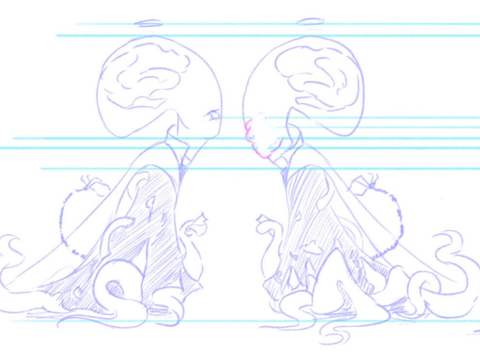
UNIT 1 : Character Design
Henry! (its a working title)
"My comfort zone is drawing delicate women wearing flowy dresses. Lets do a 180 to challenge myself"

Initial Design 1

Initial Design 2


(click on the images to expand it)
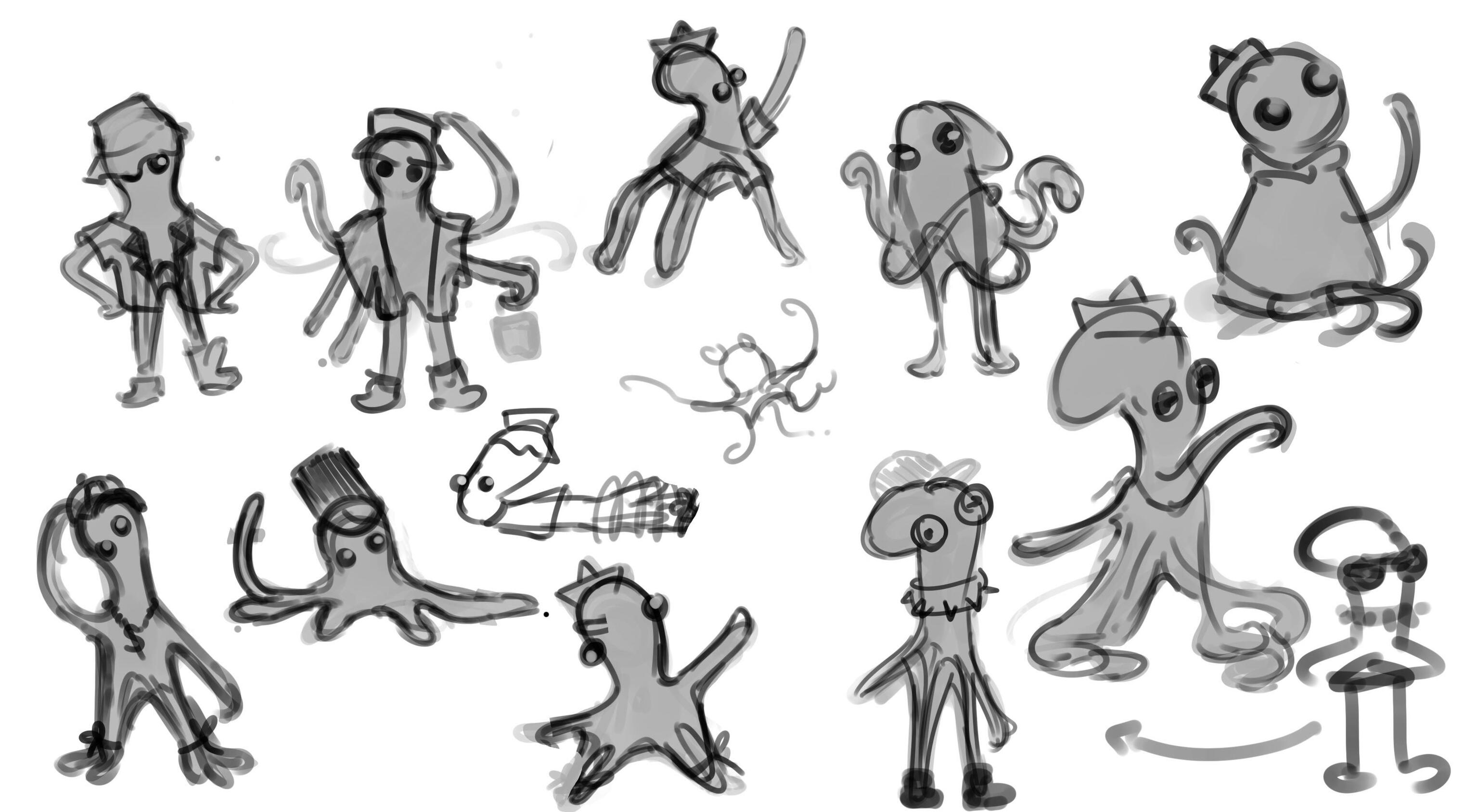
I knew I wanted a sea animal, and jellyfish just seemed fitting. I had cool ideas of Henry not having any eyelids and used his little jellyfish head, shaping him like some 2000s rapper that thinks he's cool.I wanted him to like humans, and want to become one how a little girl might want to become a unicorn. Picking up discarded scraps of clothing, he would dress himself up and walk in a humanoid fashion to seem cool.Although he started as a jellyfish, through iterations and mini doodles, he began to resemble more like an octopus, and I went along with it.
Concept:

It wasnt... cool enough- it was just so generic and lacked features that really made him unique. He wasnt dramatic enough and the shape was boring. There will always be character archetypes that focus on wanting to become something theyre not but what makes him different?I tried to experiment with different shapes, using shape language as a way to set himself apart from any generic octopus.Despite looking objectively cute, he lacked personality.
Stuff like this was just lacking...I had to revisit the drawing board and start somewhere else that isnt so vague. I needed clear artisitc direction.
Visual references!
Namely: Caine TADM, Doc Ock MCU, Dave MDGSR, Megamind, Palpatine SW


Going back to my mood board and references, I started to pick apart why I liked each character on that list. Why how despite looking cute and obeying all the 'rules' that made a character relatable, mine lacked the charm these characters had. Henry lacked depth.Caine and Megamind seemed like the perfect reference for adorably relatable characters that were somewhat morally ambiguous.I loved the idea of an evil scientist on the surface but a cute boyish cat-like personality behind closed doors.

'go crazy go stupid'

beg of evil scientist arc


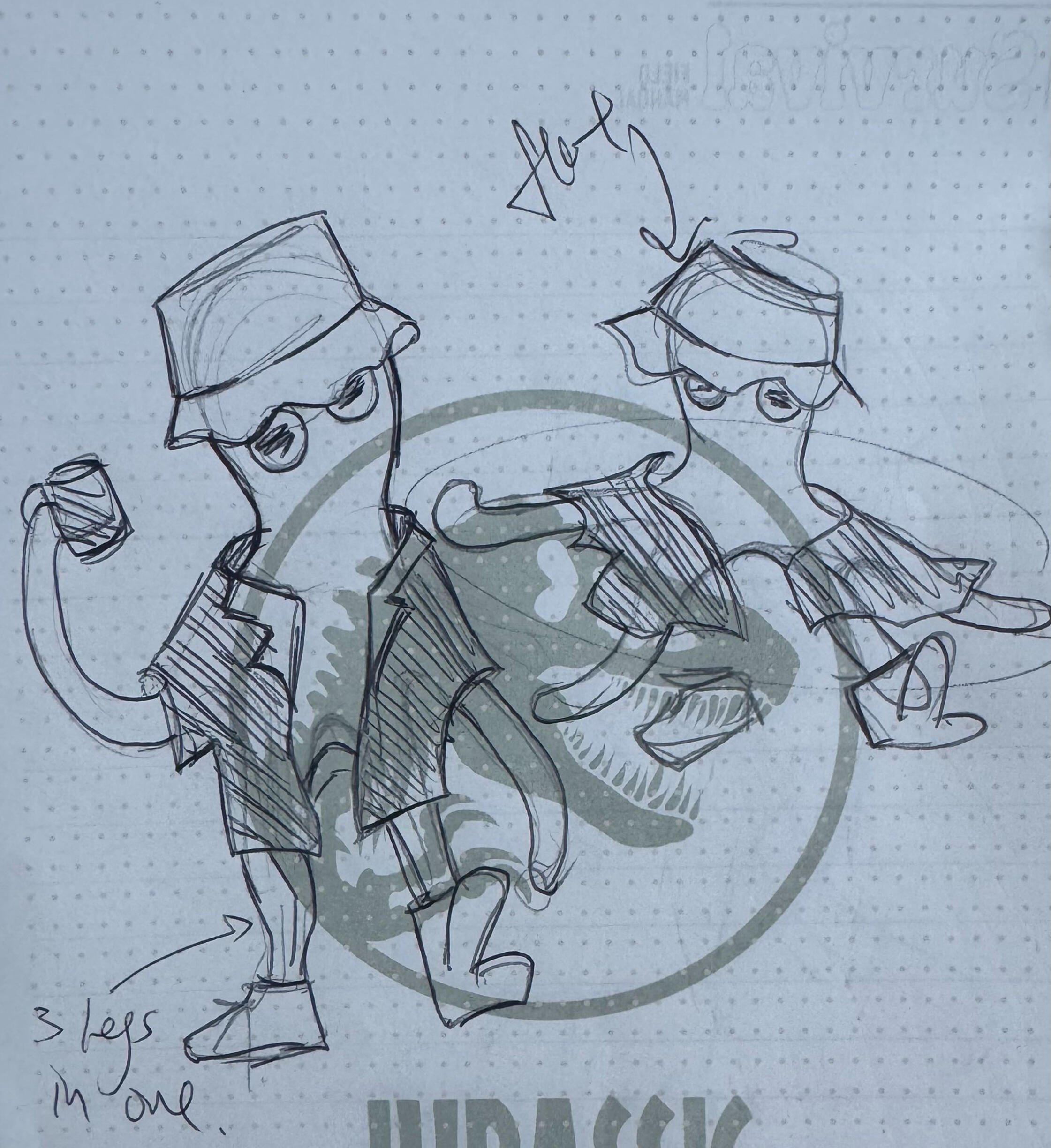
Here is where I really put that evil scientist feel into his character, and suddenly the designs made sense. Even the more rounded egg-shape designs looked cohesive and reasonable, and they even carried a little more charm.I eventually landed on a triangular / pyramid head to not only represent the sinister obsessive side of Henry, but also to contrast the fleshy organic shapes present throughout his design.


(not sponsored by jurassic park)The triangular oversized head also allowed me to almost point it like an arrow, making poses fun and dynamic.
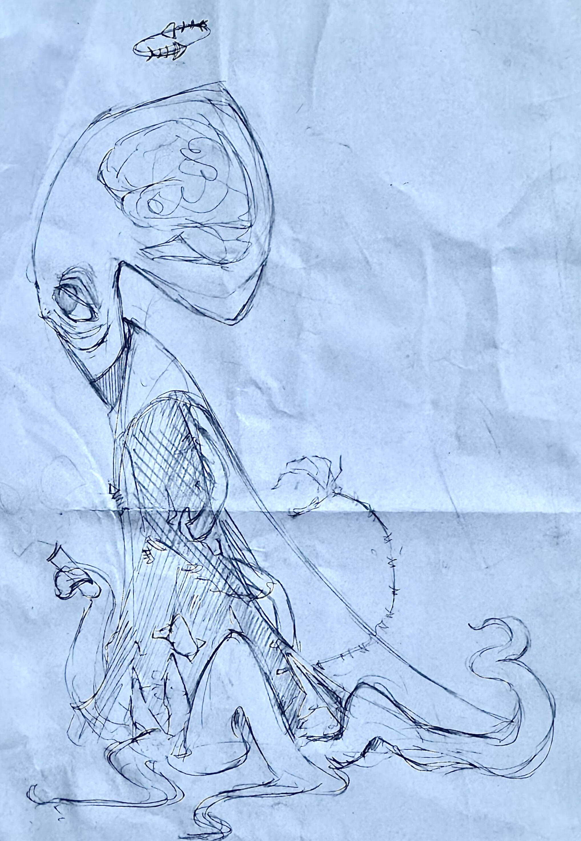
This is the first detailed concept of evil Henry. Now, he didnt just want to be a human one day, he was going to do everything in his power to make sure he is one.Grafting cybernetic limbs onto himself, experimenting on fellow sea life... grafting a human eye onto one side of his head... all to the point where he has to be on constant life support to sustain it.His body dysmorphia was really unsettling, but yet- relatable.
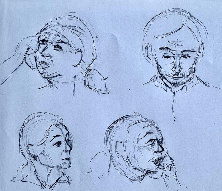
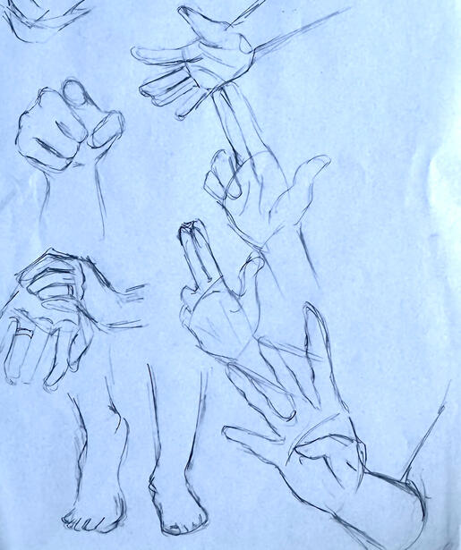
I then took a quick detour to refine my heavy and hard cloth drawing skills, along with expressions and limbs to further my range of artisitic expression.

Heavy Cloth Study

Dresses

Suits

Faces 1

Faces 2

Hands
I then sketched up a quick overview of what poses he might possibily find himself in, and how he may show his expressions.
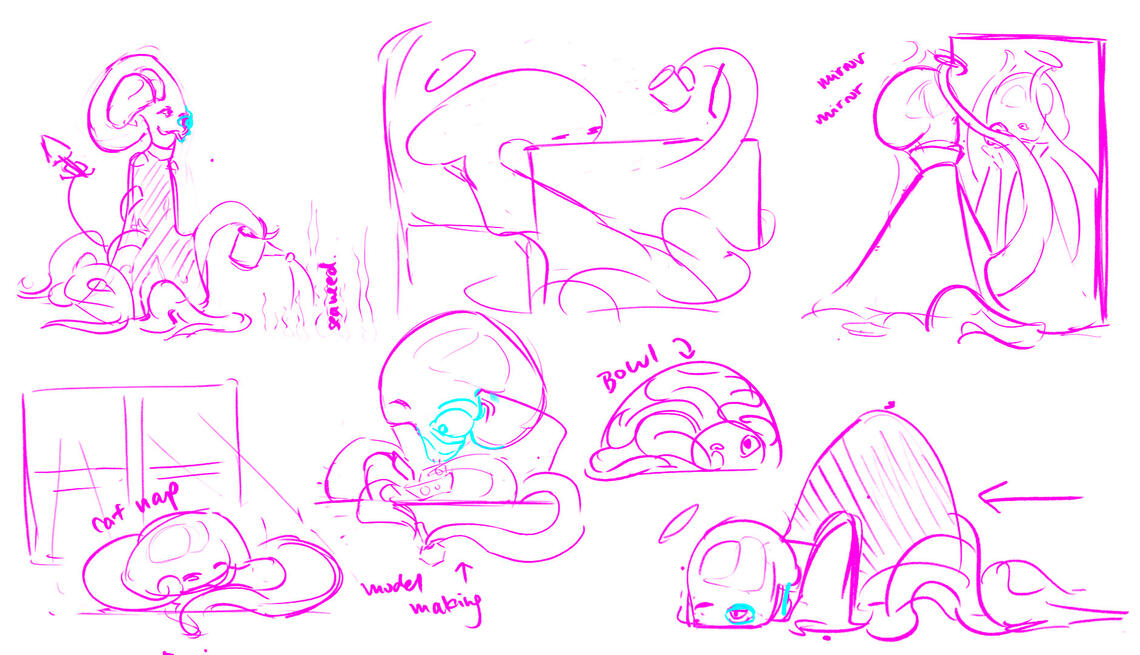
Although I originally found it difficult to express exaggerated emotions without eyebrows or a real mouth, you'll soon find out that I managed ;)
FINAL PIECES!
As to why I named him Henry?I wanted his name to reflect who he was on the inside. A little boy, who just had a dream to become something else.
(Press to enlarge!)

Character Construction

Turn Around
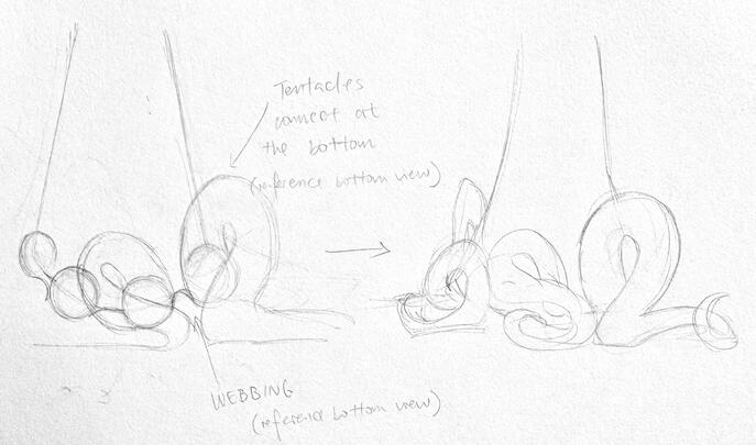
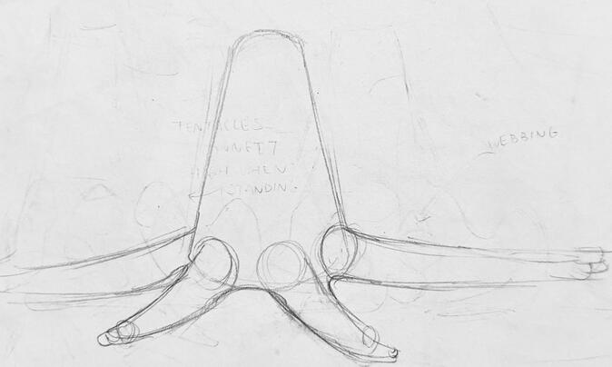
Tentacle Construction

Poses

Expressions

Bottom View
flat.


Process (designs and walkthroughs)

About

UNIT1

plaaceholderrr

Contact

Bin
Creation of NEON (vrc world)
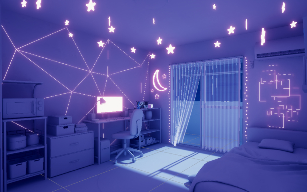
(When I first had the idea of making NEON, I was in math class)
Blender... (the death of me)
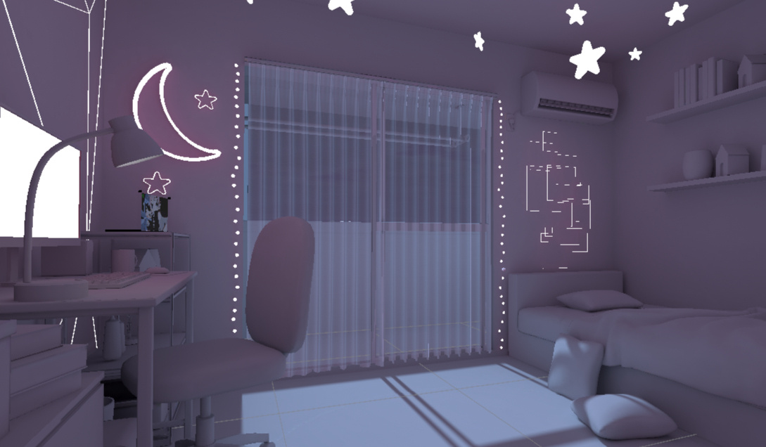
Left < without post processing
Right > prefab view
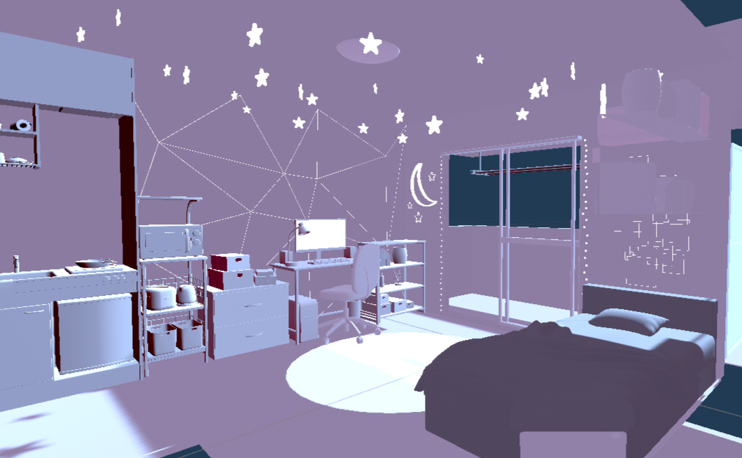
With the help of AyStandard_Curtain shader, Midnight post processing, Bakery and many more...
Process (designs and walkthroughs)
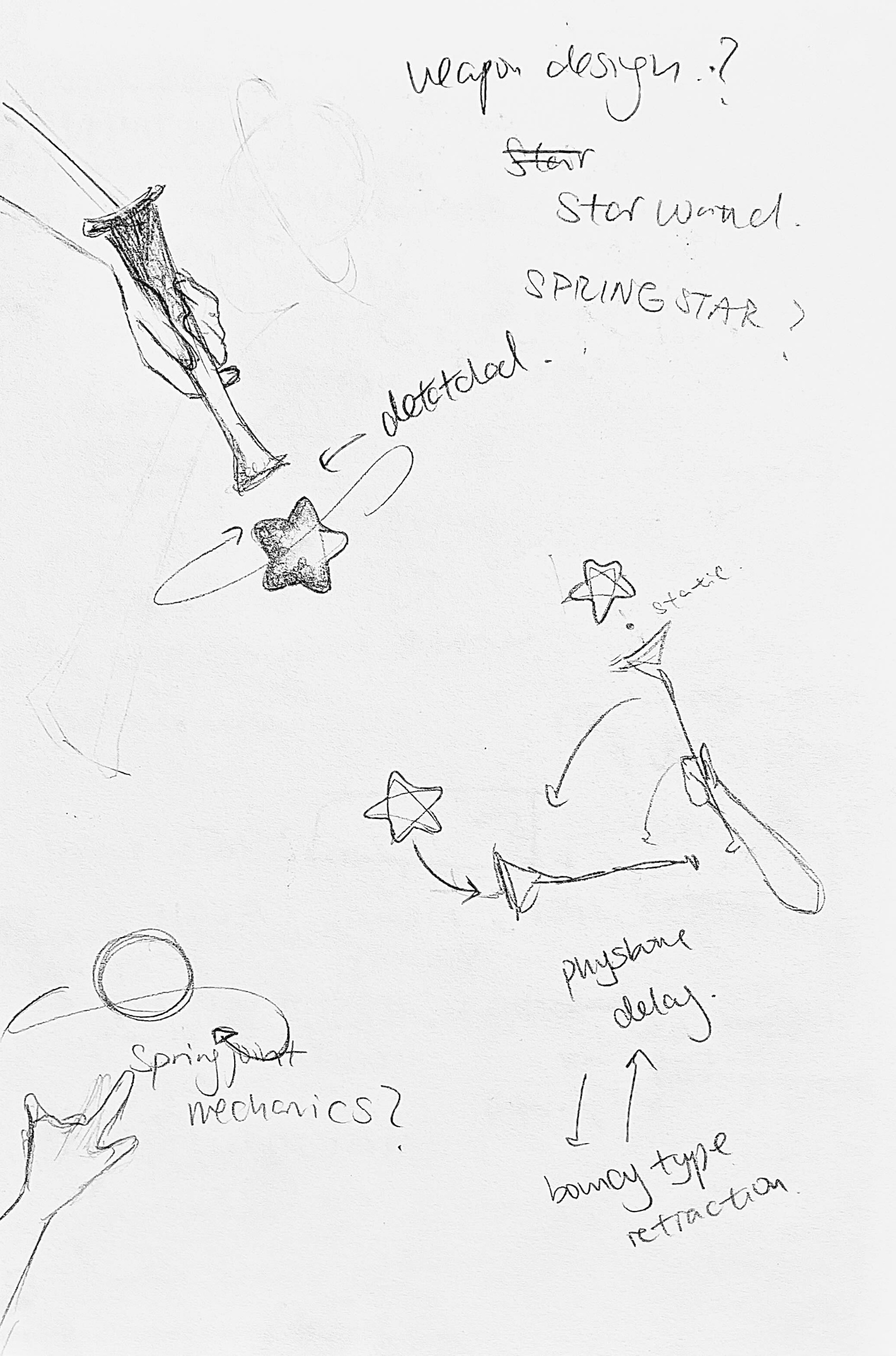
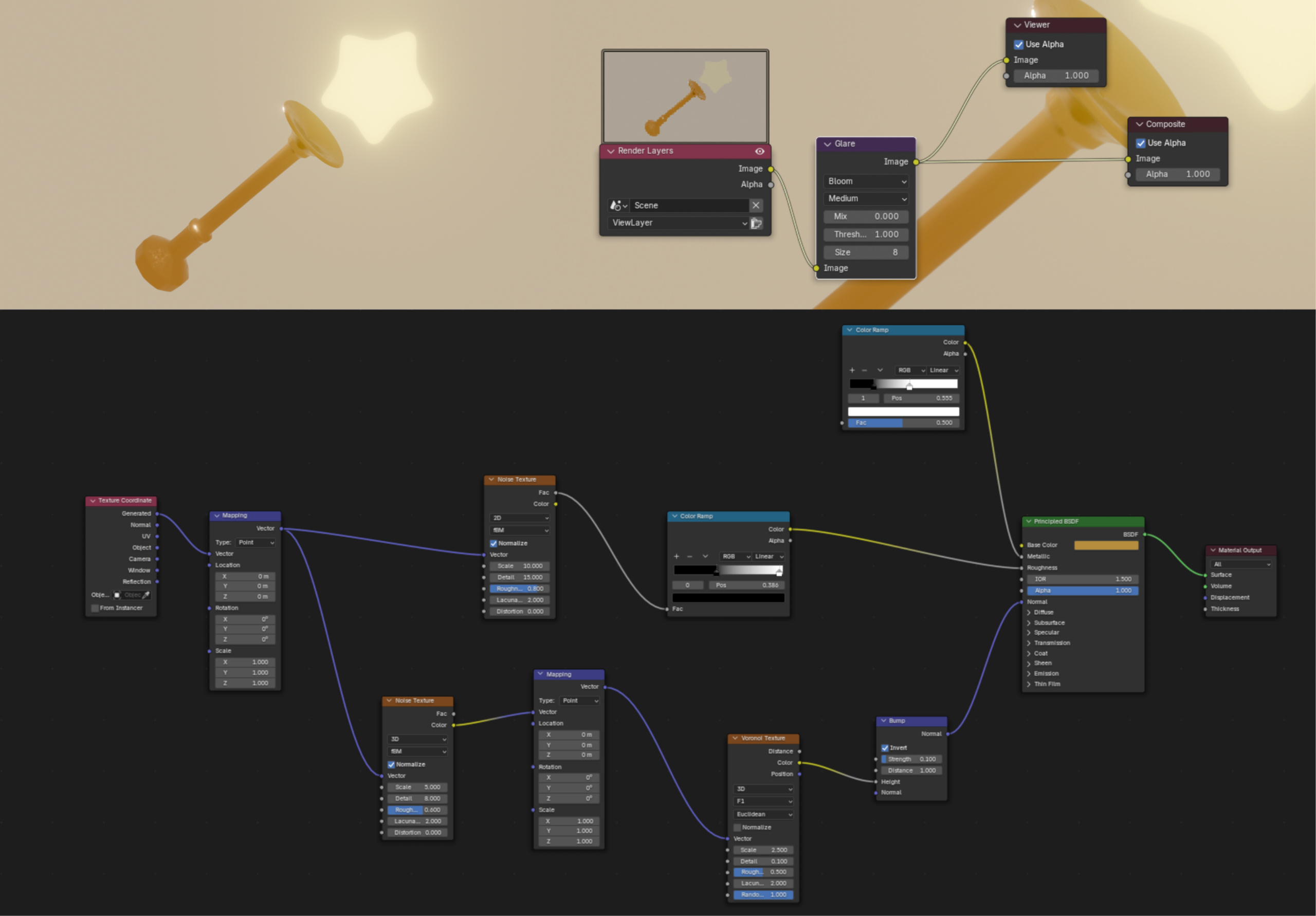
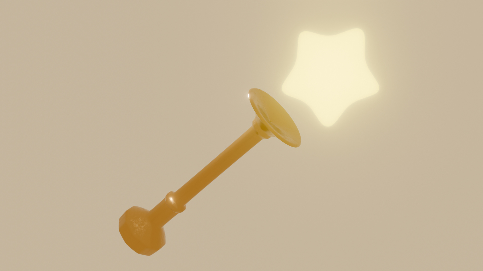
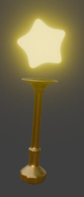
Creation of STARJOINT (asset)
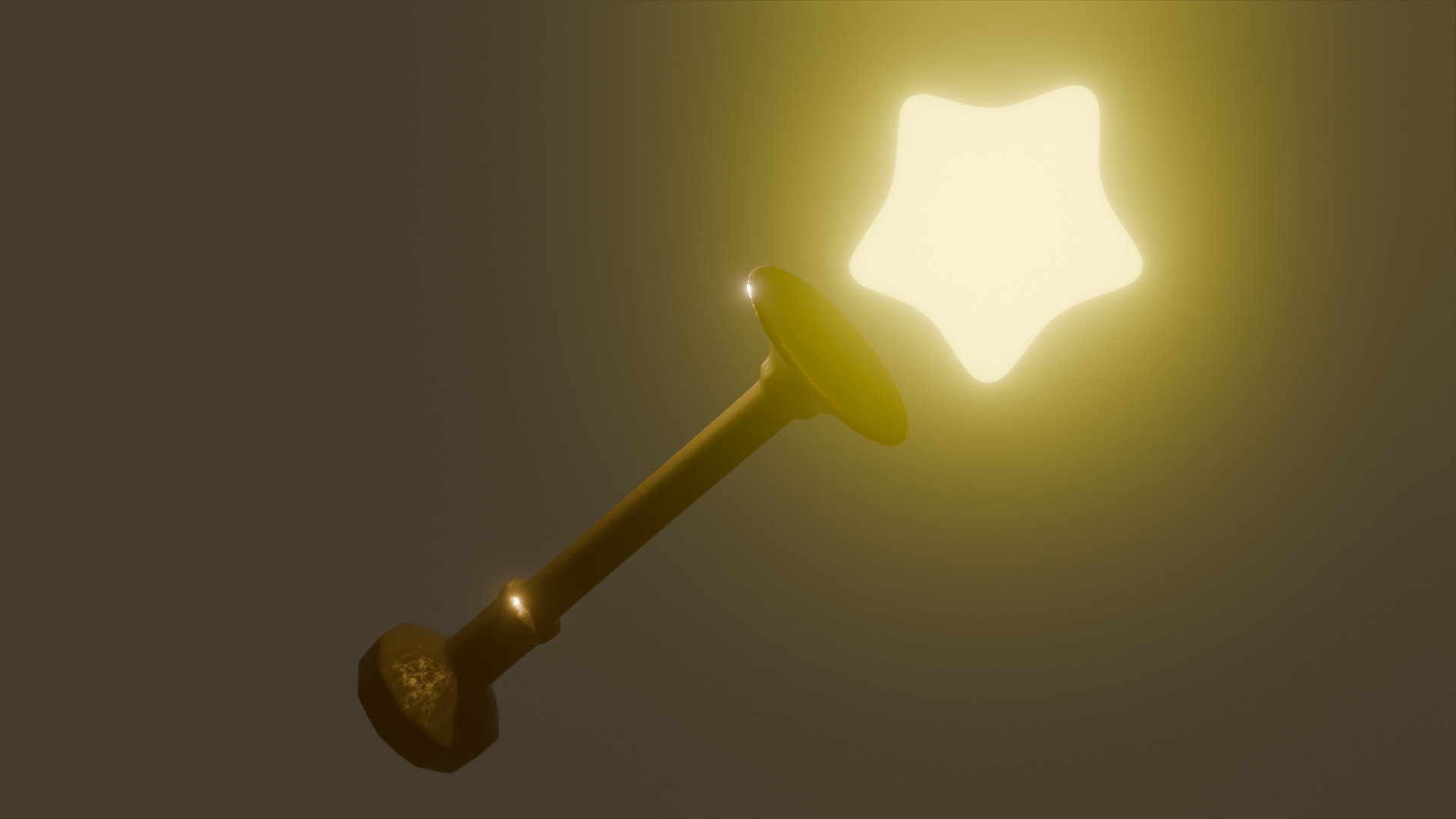
The original idea would have made this more of a fidget toy instead. a bouncy back and forth star, rooted ontop of a wand.
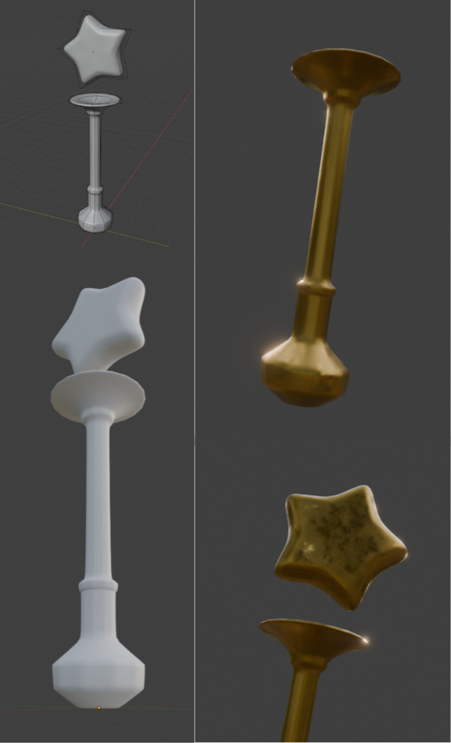
Materials + Rendering
Process (designs and walkthroughs)
Sketches:
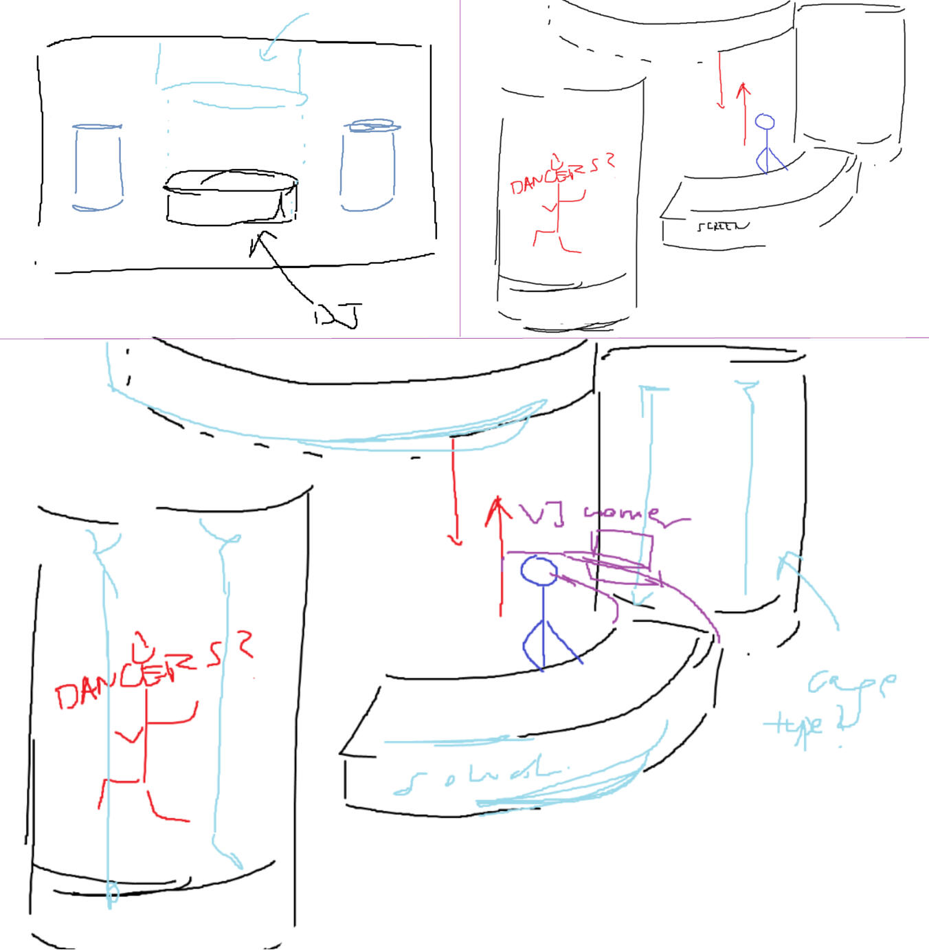
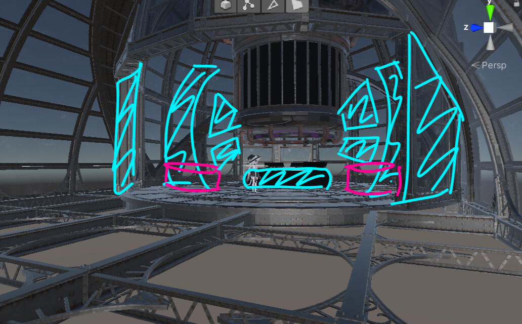
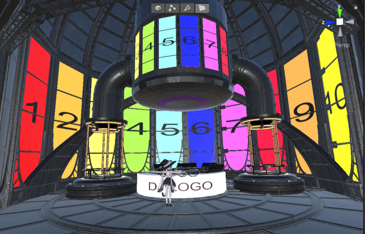
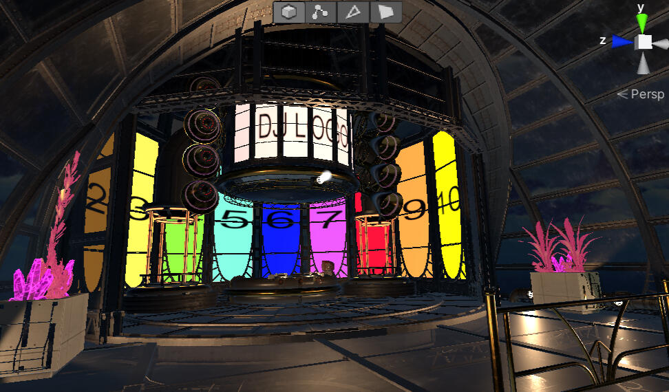
This was my most recent map, a collaboration between 5 unity nerds.The map was built with a kitbash approach, with assets curated by me and properly credited in-world.Designed for the annual VTVR New Year's Eve event, the venue is capable of holding up to 200 virtual attendees.
The venue's gone through dozens of iterations...
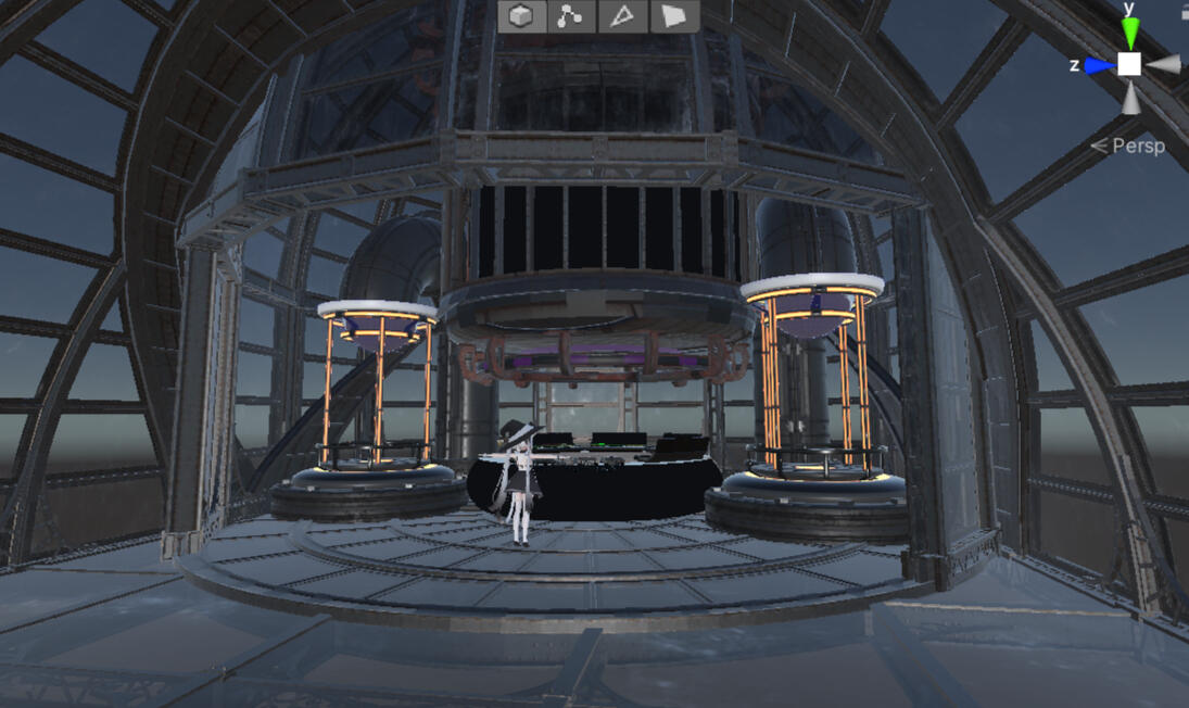
Lighting, Rendering, and Animations
Process (designs and walkthroughs)
My sketchbook:
what ive been up to this week!

dazed.jpeg

princesssaturn.png

soup.jpeg

spacemarine.jpeg

marvelrivalsREDESIGN.exe

poster4upcoming.png


Showcase: Sound Empire
Trailer:
Unity Walkthrough:
More photos:

unity1

unity2

unity3


FINAL:

final.soundempire

Showcase: Choice (2019)
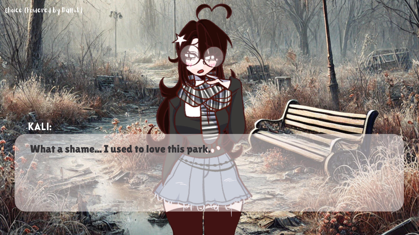
Choice was originally made as a stupid project for my friends because I wanted to convince them that their personalities reflected in everyday choices. It was originally called 'The Alcie Psychic Project' and was built entirely online using a visual novel maker.I then used the available generative AI at the time (running locally on my own computer) to create unique backdrops based on each player’s ending. For example, if someone got the 'MBTI: INTP ENDING- you didn’t water the flowers,' DALL-E would generate a new scene reflecting their choices, which would then show up in the next player’s playthrough.Since it was made just for my friends, the choices limited and were tailored to their MBTI types. (figuring out every possible personality combo would’ve taken forever.)When I then shared my progress on Twitter, many other friends in the community got curious and wanted to try it out, so I then sent the game to them too, making it a limited access- but public game.(Fun fact! Before this limited semi-public release, I also added in a global chat function, which was extremely broken and almost crash the game)
For example:
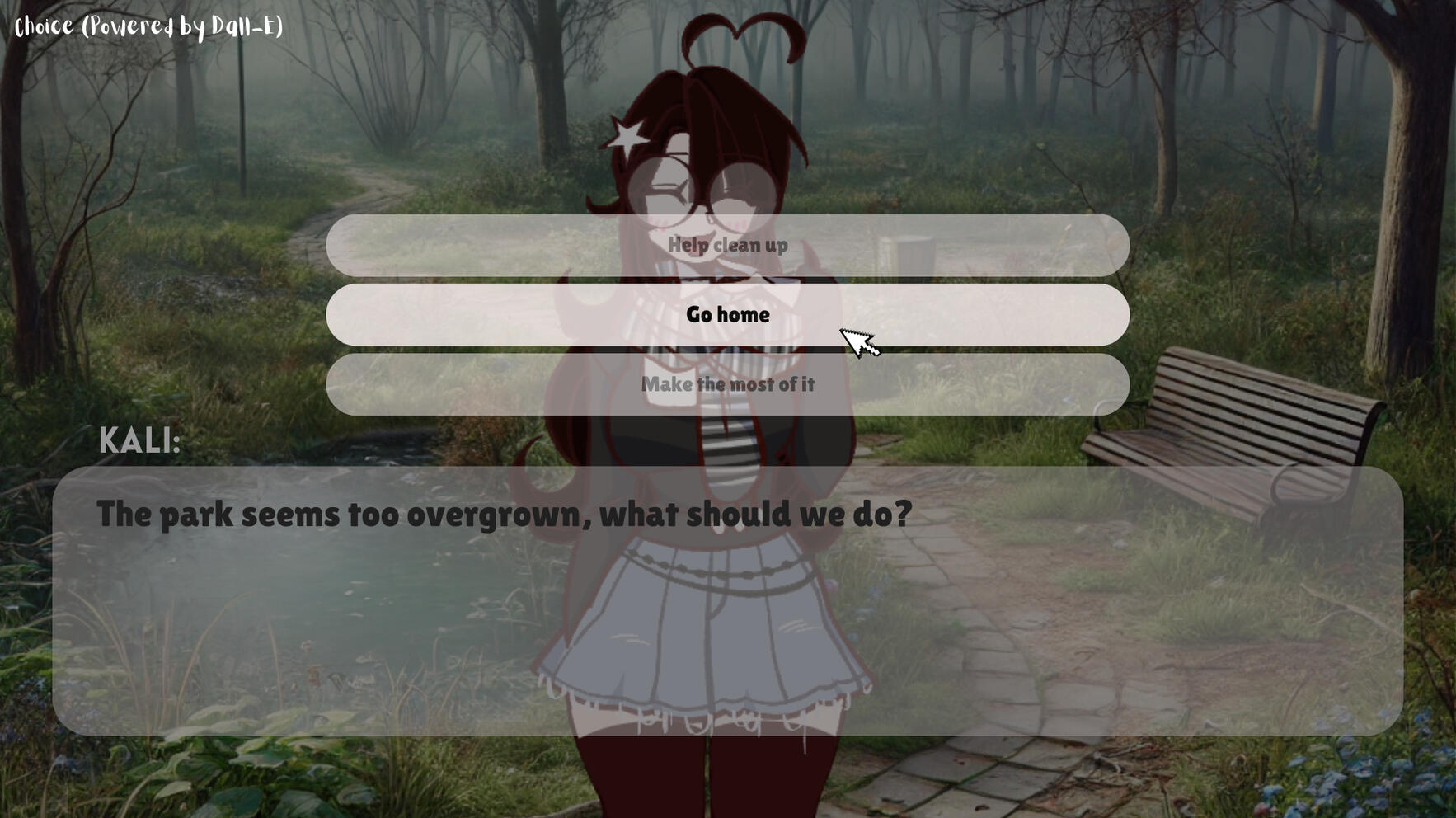
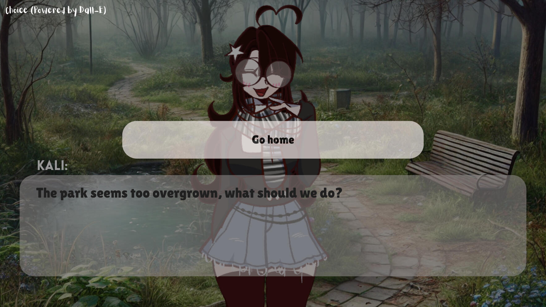
Ending/ upon next play through/ next player:
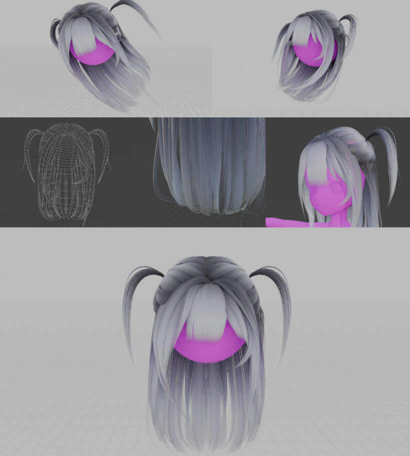
Showcase: Avatar Modeling
The avatar I use in VR and other projects that require character creation:
Design:
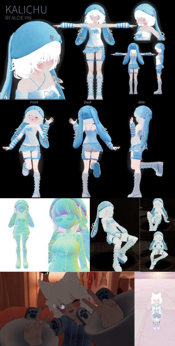
Showcase: Kalifornia
Based on my hair in real life at the time, I made the 3D character asset Kalifornia.
Blender + Liquid Sims
Warning
You can't do that. Well you can but I don't recommend it. Don't let me stop you though. Do what you want.
Creator Easter Egg
Well aren't you curious...